About Me
Contact Me
Conceptual Art
Kvartira-11 / New New
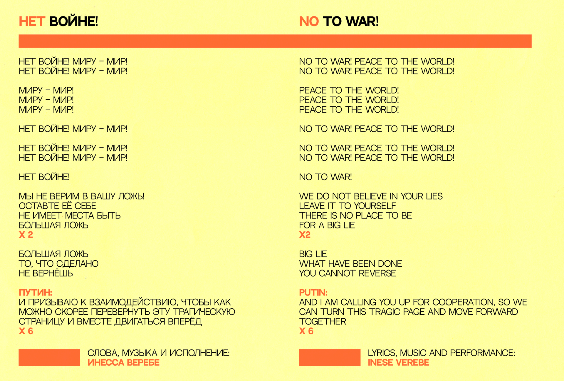
No To War! Peace To The World!
New Media
Imagining Song Patterns
What Your Eyes Draw? Pt. 1
What Your Eyes Draw? Pt. 2
Smart Pattern Generator
Vowels We Sing
Accessible Forms
Album Cover Art
mis·cel·lan·eous
Keep Dancing
How Deep Is Her Voice
INkBlot
Following FiguresTrick Of The Light
Kvartira-11 / New New (2023)
Be cautious, authorities might be listening!Flat-11 / New New is my final year BA(Hons) Interaction Design course work at The Glasgow School Of Art.
This work is mixing references from personal experience supported by historical context of Post-Soviet Space.
The video abow is a visual summary documentation of my journey through the project.
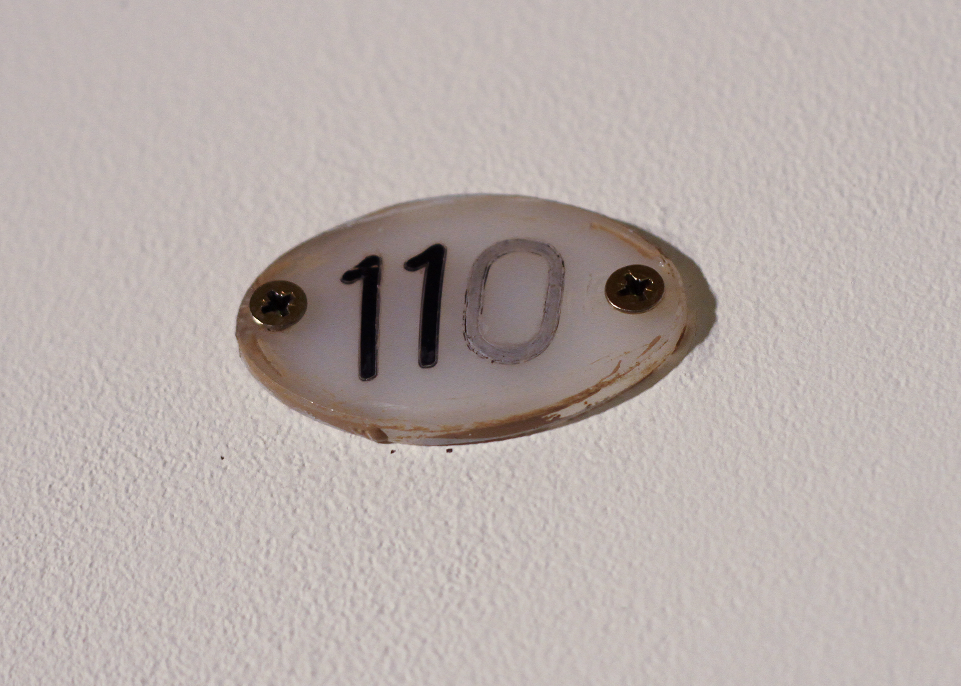 Soviet Plastic Door Sign 110 to 11, 2023
 Intentionally modified from 110 to 11. It’s the symbol of the environment where I grew up. Because of the product shortages during USSR sometimes people would have to get creative with the little they have so did I when failed to find an actual door sign with “11” on it.
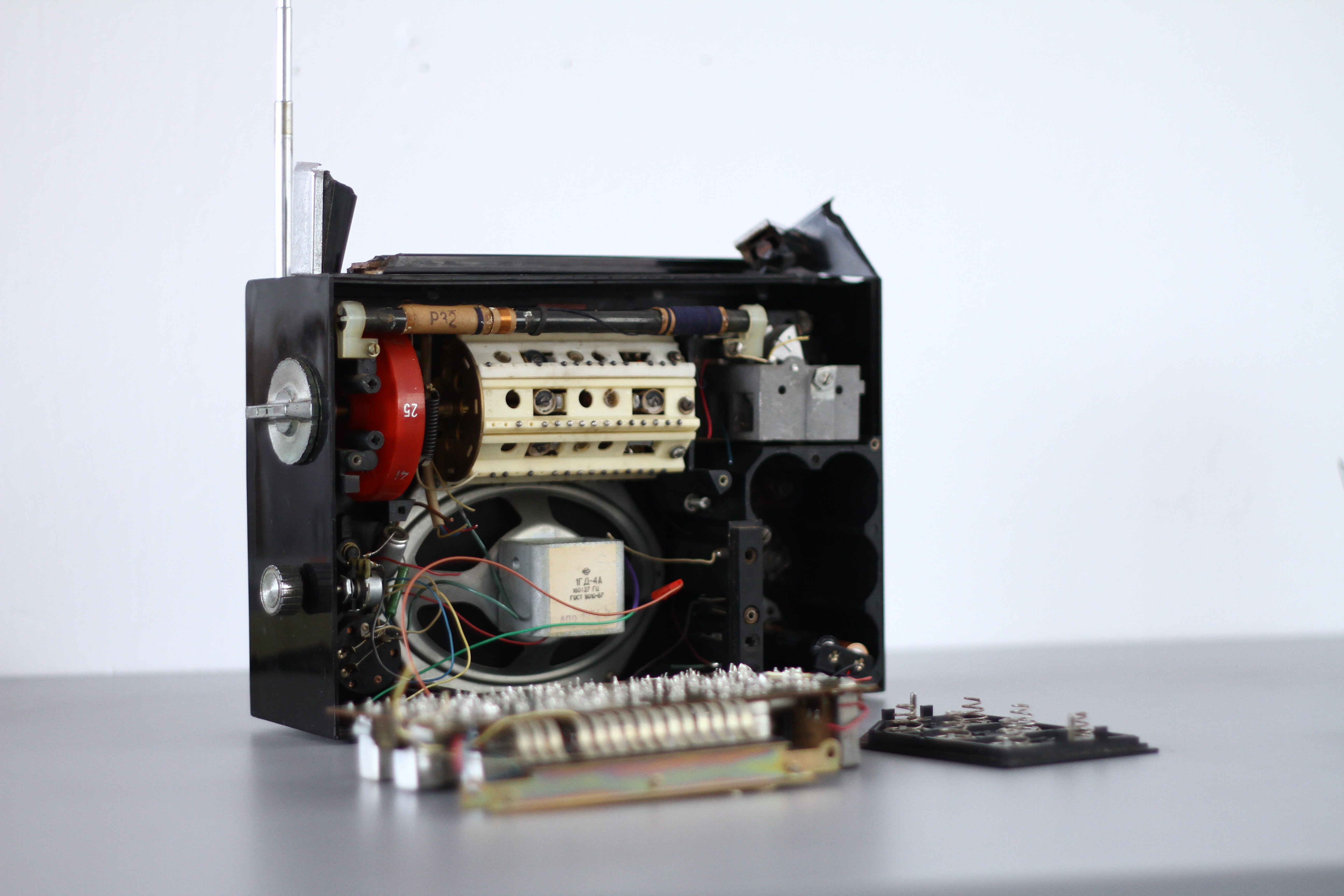
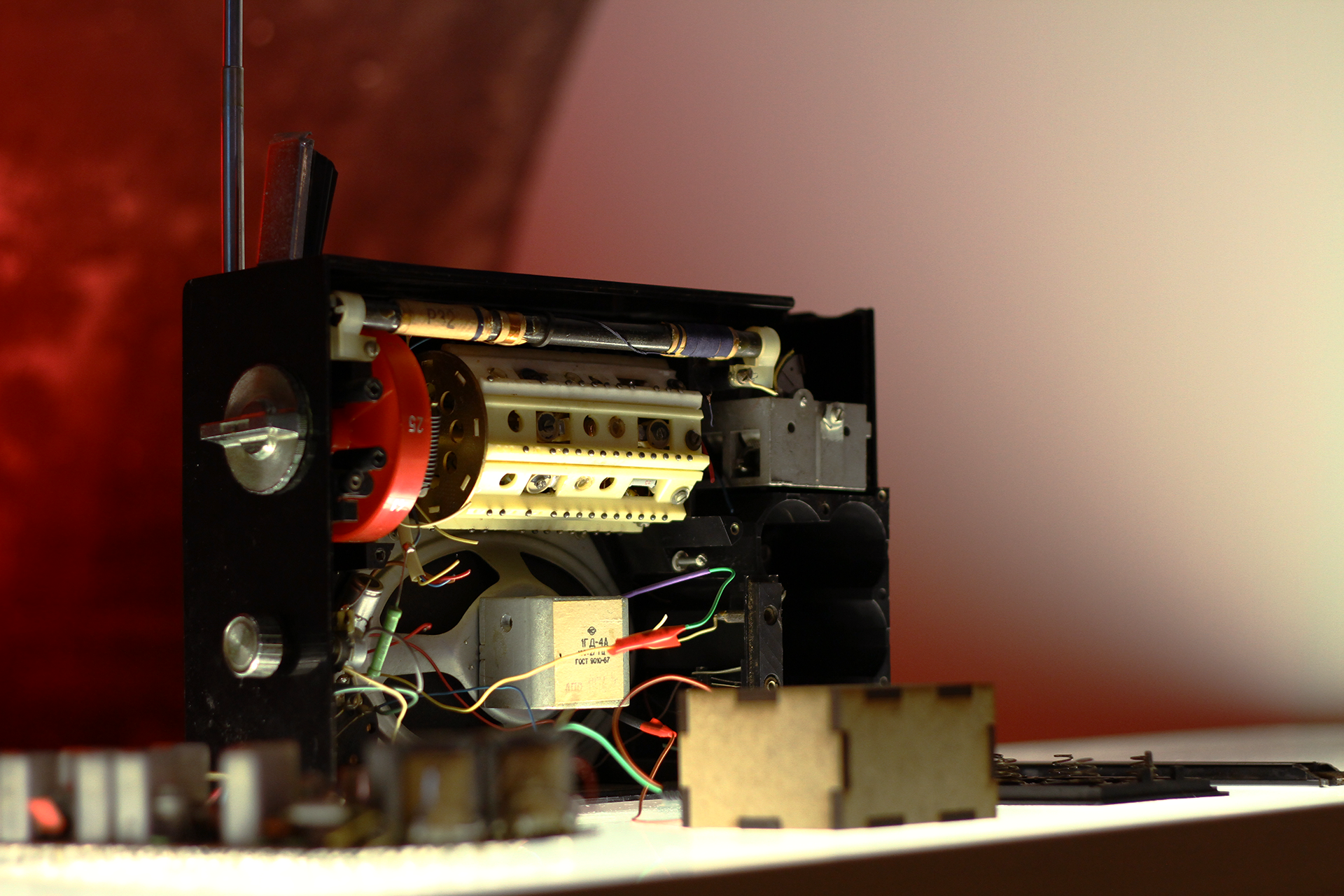
After an unfortunate accident with a Soviet radio falling on the concrete floor I’ve decided to give it a second breath by reusing the original mono speaker with a new FM receiver instead of old AM one.
While working on this project I was interested in using found objects and making them part of the design in the newly created interface and curated exhibition space for The Glasgow School Of Art Degree Show, 2023.
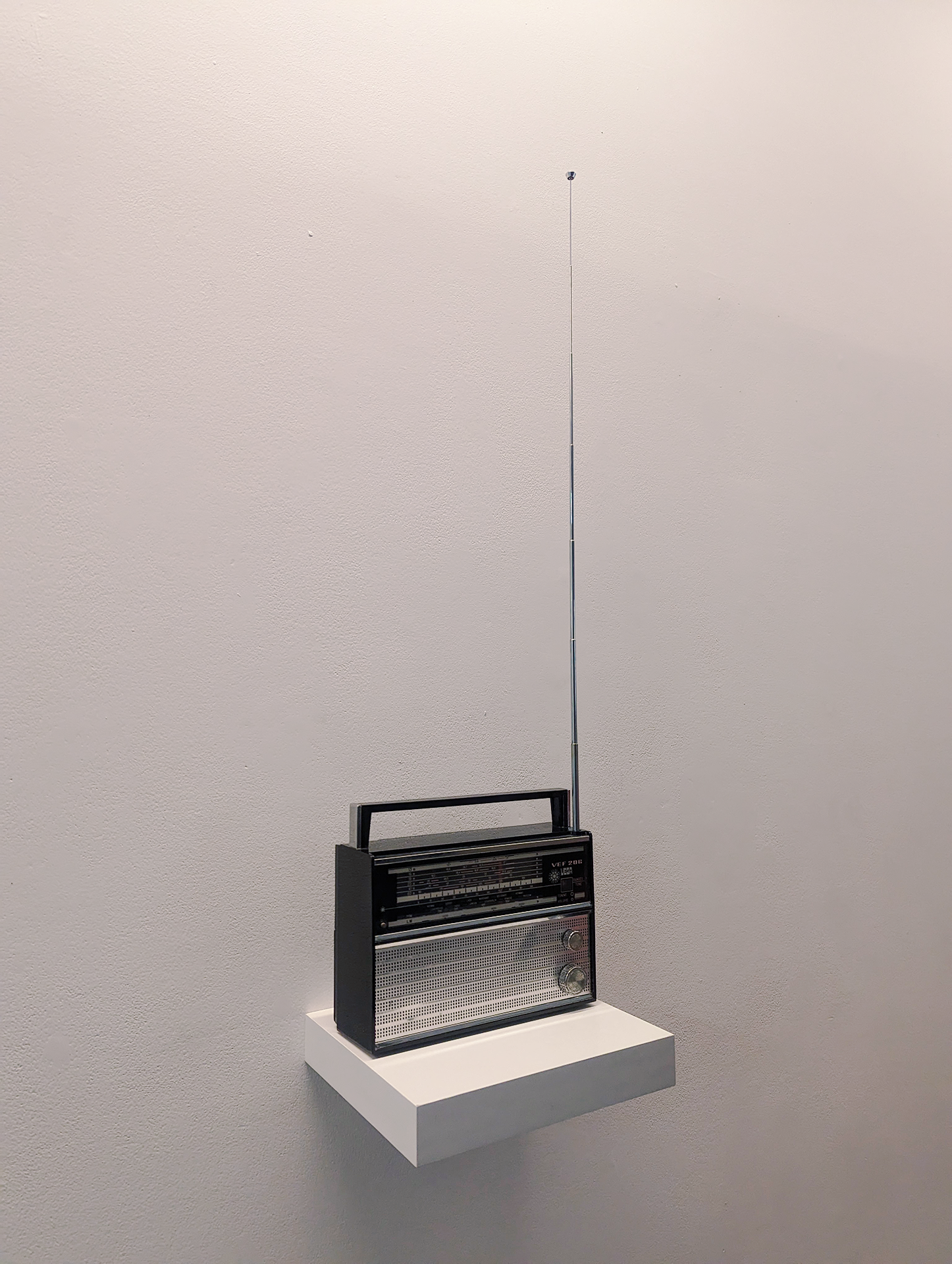
 Perestroika of VEF-206, AM to FM Receiver Replacement, 2023
While doing research on the development of the USSR subculture for my dissertation I’ve made a decision to interpret certain cultural concepts of social interactions within sound installation inspired by DIY culture in the Pre and Post-Soviet Union. I am reflecting on the Soviet past in my home country, where 50 years of Russification left 50% of Russophones in Riga, capital of Latvia, including myself.
My childhood was in the early 90s after the collapse of the USSR. I remember flat parties my parents would host while living in a tiny flat within the Soviet Tenement of the 1-464 series. Diverse music was played ranging from Russian Rock and Pop, to German Techno, not forgetting my grandmother’s favourite band - Modern Talking. In this environment I grew up into a ‘mélomane’, but without any opportunities for studying music professionally.
By immersing myself into the Alternative subculture in my youth and learning to play guitar, I realised that you do not necessarily need a diploma to make music. After years of collaborating with different musicians, bedroom producers on music projects and experimenting with sound production myself I am realising that with the development of Digital Audio Workstation, you can even forget about learning a music instrument at times.
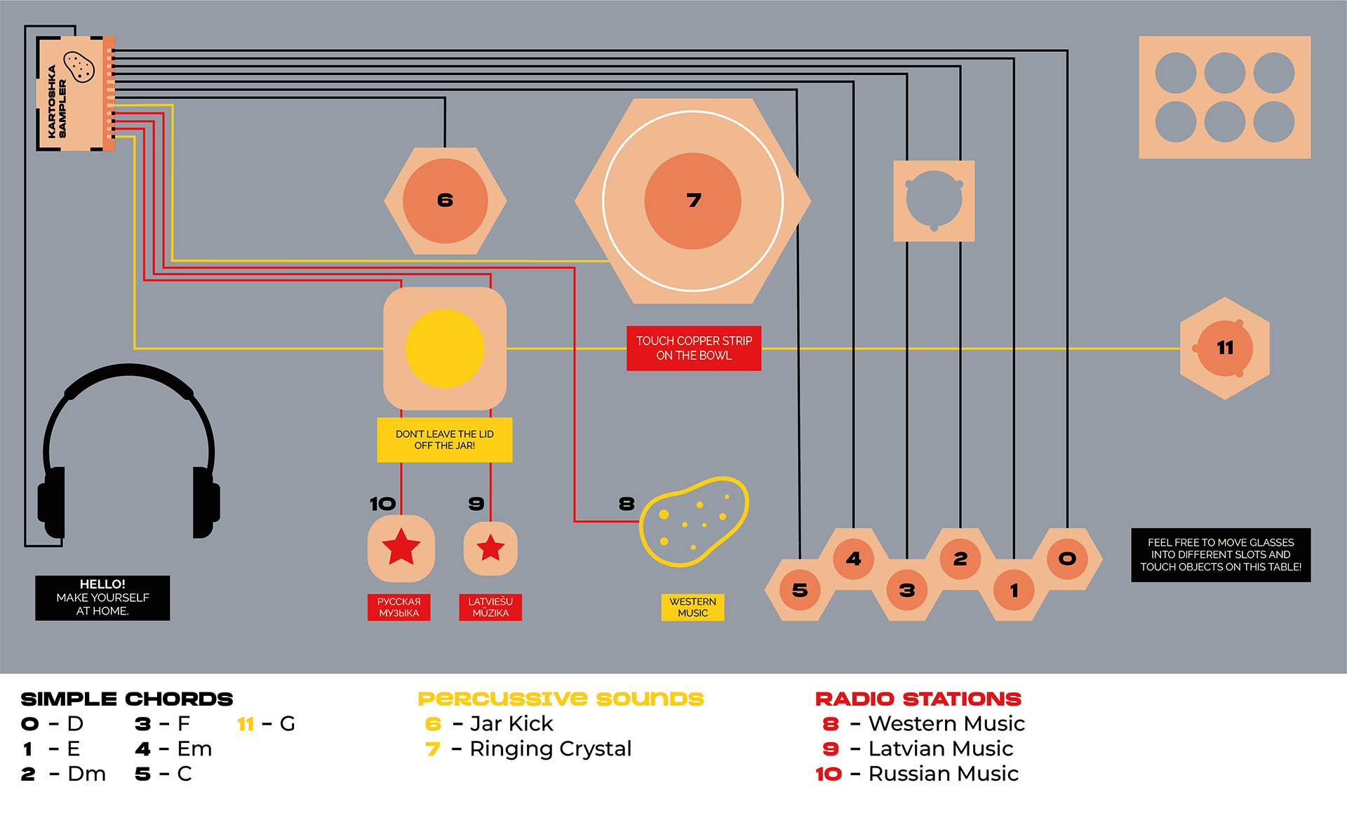
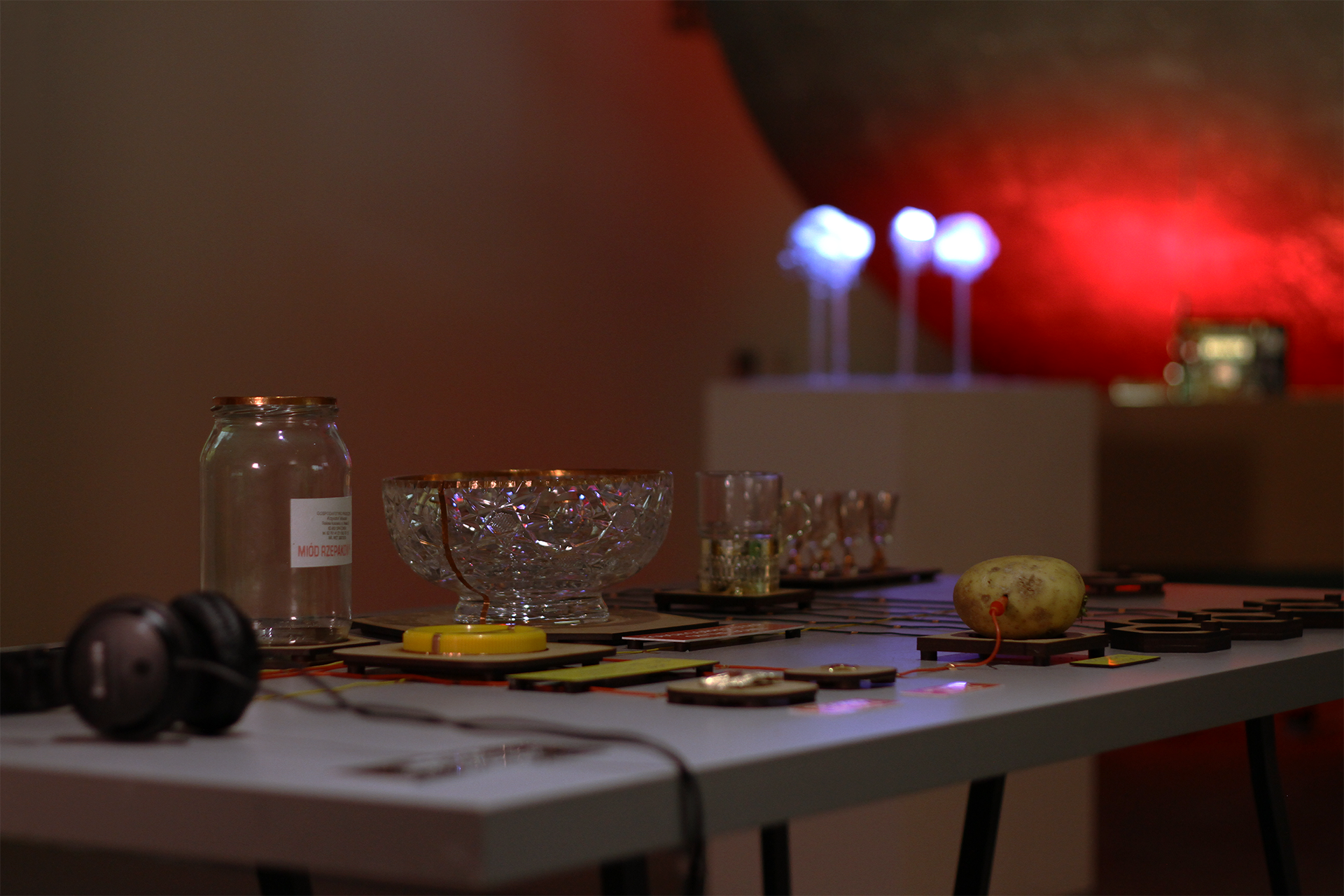
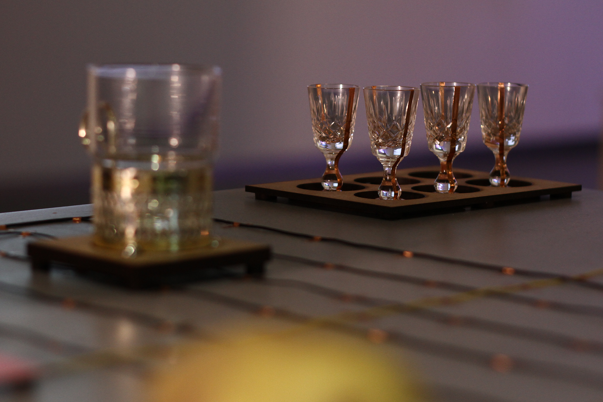
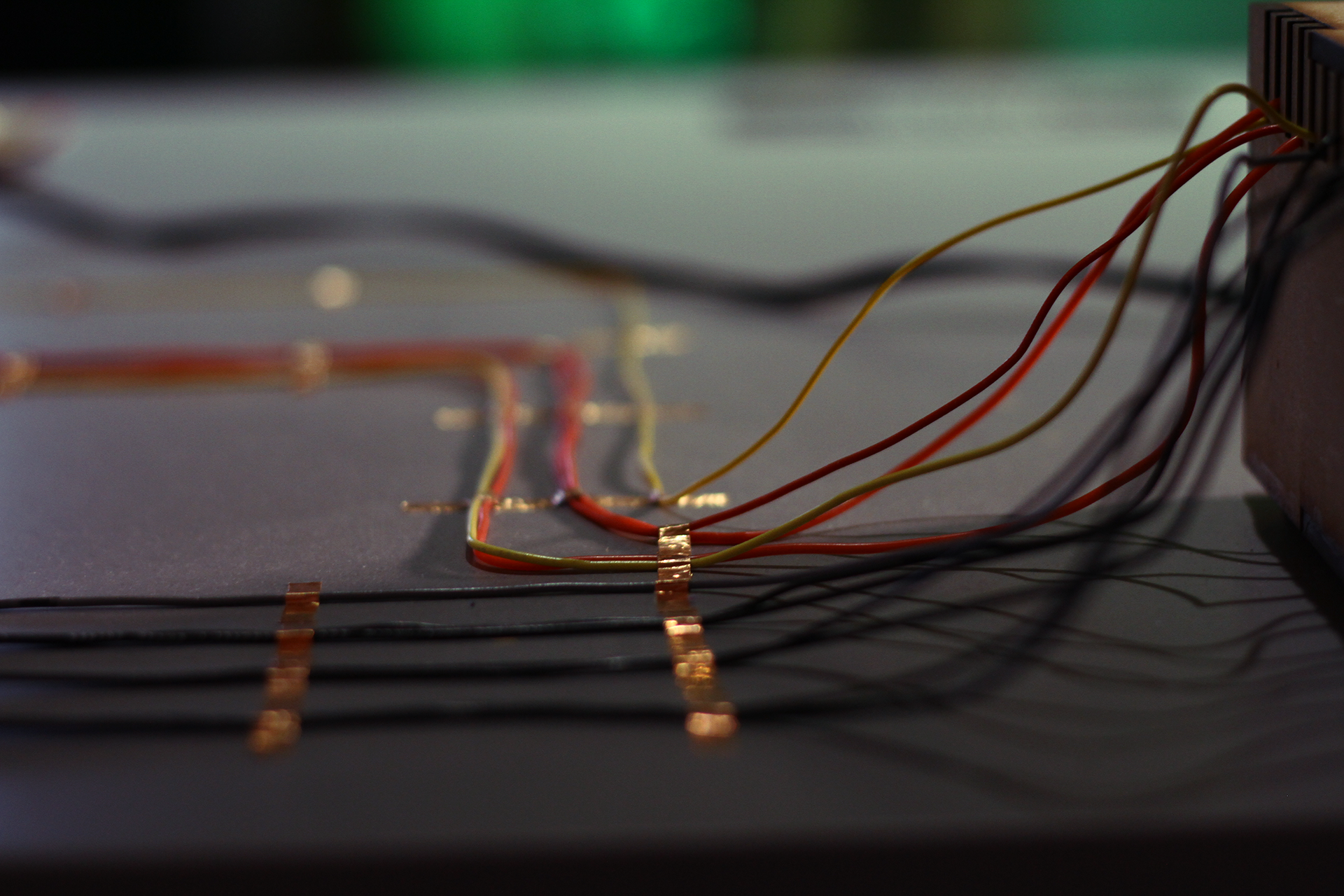
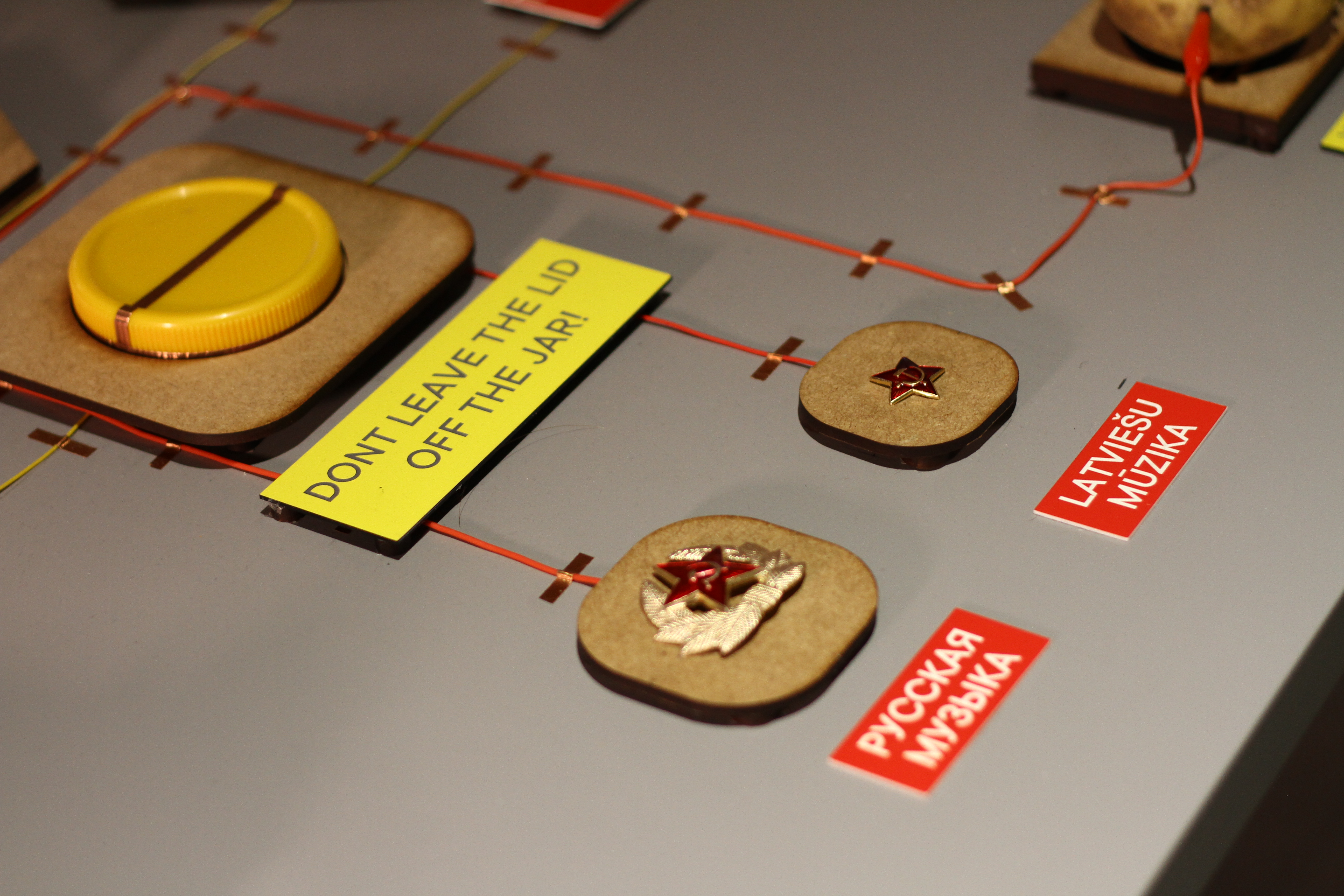
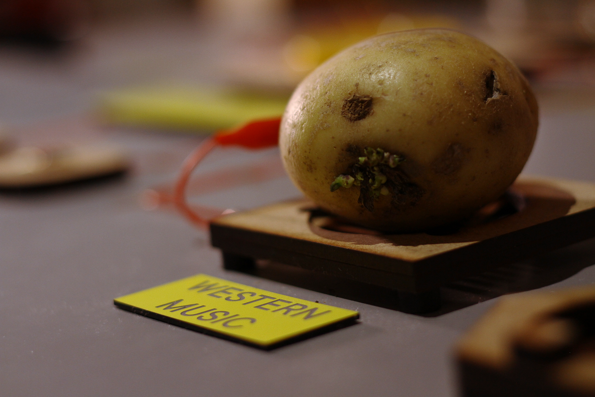
My piece is made from typical everyday objects which could be found in every Soviet flat and these act as sound triggers using capacitive sensing technology. Samples you hear are pre-recorded sounds of objects, snippets of songs with sentimental value, or basic chords with customly recorded and processed sounds.
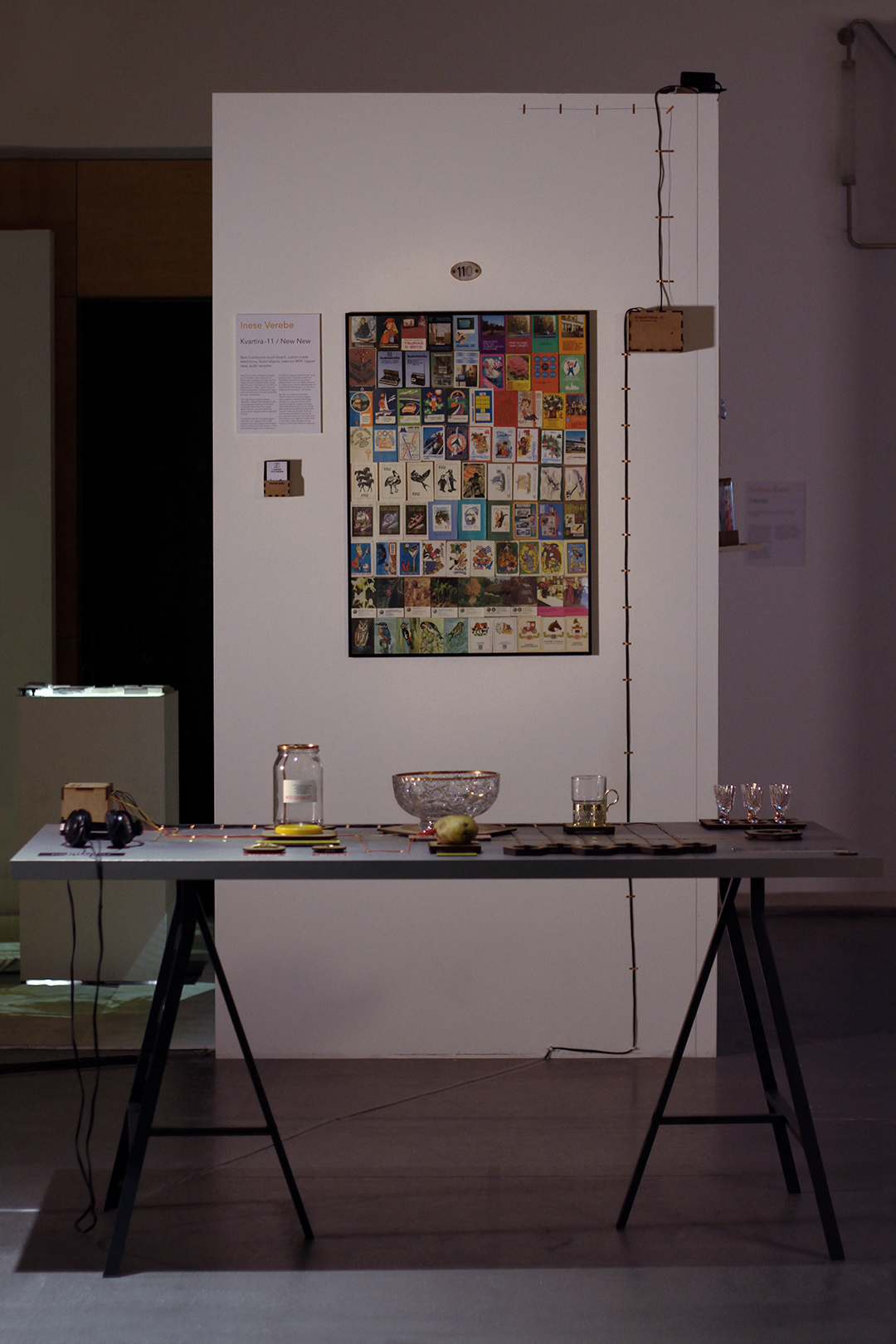
In this setup you can find enough chords to put the right sequence to play a Soviet Anthem and a lot of your favourite songs. All the noise you are making on this proletarian table is transmitted to the radio which is located on the different spot within ehxibition space.
![]()
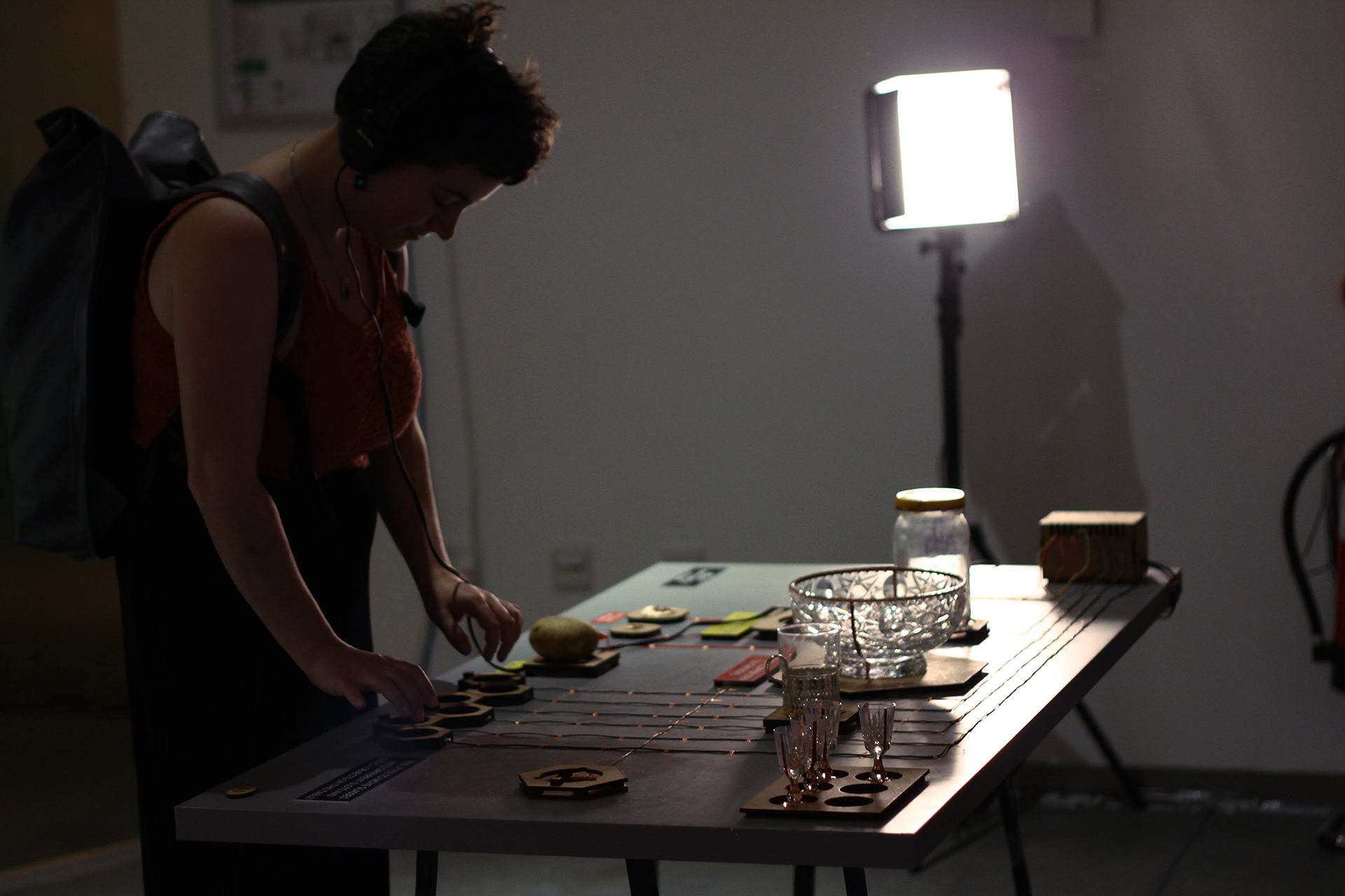
“Kvartira-11” 1st Setup during Work In Progress Show in the Reid Building of The Glasgow School Of Art.
Photo by Dommé Ewan, 2023
![Schematic layout of the table during concept development.]() Schematic layout of the table with space and relationships adjustments between objects after reflection on the Work In Progress Show mostly improvised setup, 2023
Schematic layout of the table with space and relationships adjustments between objects after reflection on the Work In Progress Show mostly improvised setup, 2023
My childhood was in the early 90s after the collapse of the USSR. I remember flat parties my parents would host while living in a tiny flat within the Soviet Tenement of the 1-464 series. Diverse music was played ranging from Russian Rock and Pop, to German Techno, not forgetting my grandmother’s favourite band - Modern Talking. In this environment I grew up into a ‘mélomane’, but without any opportunities for studying music professionally.
By immersing myself into the Alternative subculture in my youth and learning to play guitar, I realised that you do not necessarily need a diploma to make music. After years of collaborating with different musicians, bedroom producers on music projects and experimenting with sound production myself I am realising that with the development of Digital Audio Workstation, you can even forget about learning a music instrument at times.
My piece is made from typical everyday objects which could be found in every Soviet flat and these act as sound triggers using capacitive sensing technology. Samples you hear are pre-recorded sounds of objects, snippets of songs with sentimental value, or basic chords with customly recorded and processed sounds.
In this setup you can find enough chords to put the right sequence to play a Soviet Anthem and a lot of your favourite songs. All the noise you are making on this proletarian table is transmitted to the radio which is located on the different spot within ehxibition space.

“Kvartira-11” 1st Setup during Work In Progress Show in the Reid Building of The Glasgow School Of Art.
Photo by Dommé Ewan, 2023
 Schematic layout of the table with space and relationships adjustments between objects after reflection on the Work In Progress Show mostly improvised setup, 2023
The Glasgow School Of Art Degree Show
2 - 11 June, 2023


Press:
The Skinny - GSA Degree Show 2023: School of Design
The Glasgow School Of Art I nteraction Design Catalogue 2023
No To War! Peace To The World! (2022)


No To War! Peace To The World! / Sound Installation During Open Share Exhibition // 2022
Sonic Art // Headphones, Spatial Audio Collage, Print on Paper, MDF Wood, Laser Cut
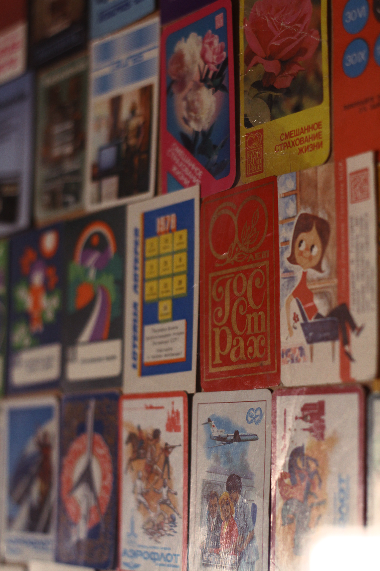
Being born in the debris of the Soviet regime in the early 90s in Latvia, and being raised in an environment of old values, as a child I was looking at a collection of Soviet postcards built by my family over the years with loud anti-war slogans from Brezhnev’s epoch. As I grew up, the perspective of the stories I would hear from some representatives of the USSR generation would not match the record of modern history books. This made me realise the effectiveness of long-term propaganda.
“Putinism” in modern Russia became possible because of the 69 years of Soviet oppression and the 1993 constitutional crisis, together leading to the current Russo-Ukrainian War. Design of the propaganda language is clean, using bold statements, repetition, as well as deforming reality by turning words upside down.
“Putinism” in modern Russia became possible because of the 69 years of Soviet oppression and the 1993 constitutional crisis, together leading to the current Russo-Ukrainian War. Design of the propaganda language is clean, using bold statements, repetition, as well as deforming reality by turning words upside down.
The lo-fi sound collage is built around Vladimir Putin’s declaration of war on Ukraine and uses various ways of worsening sound: applying distortion on unexpected instruments like piano, and on already overloaded desperate screams which were recorded through headphones. Some parts of Russian Federation’s president are cut and looped as a reference to propaganda medium.
In contrast to soundscapes full of horror I am using multiple tracks with operatic vocals as a glimpse of hope and encouragement for those who are not supporting bloodthirsty military actions to speak up, as well as to give the composition a dramatic and old fashioned feel. This style of vocals often can be heard in the Russian Romance music genre.
In contrast to soundscapes full of horror I am using multiple tracks with operatic vocals as a glimpse of hope and encouragement for those who are not supporting bloodthirsty military actions to speak up, as well as to give the composition a dramatic and old fashioned feel. This style of vocals often can be heard in the Russian Romance music genre.
Repeating same old ways never led any further than before.
This is a line from one of the song lyrics I was working on, a few months after the start of the Russo-Ukrainian War. It criticises dictatorship and Russian imperialism. The next set of images started as a one off experiment with a prompt driven AI art generator. The results turned out way too interesting for me not to use this imagery for one of my art projects. The visual aesthetics, after combining images of the world’s the most famous dictators, such as Adolf Hitler and Joseph Stalin, with Vladimir Putin in this Goblin tale is reminiscent of the distorted style of German expressionist Otto Dix, who depicted the brutality of war with his art pieces.
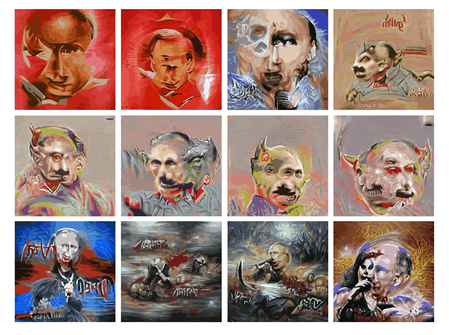
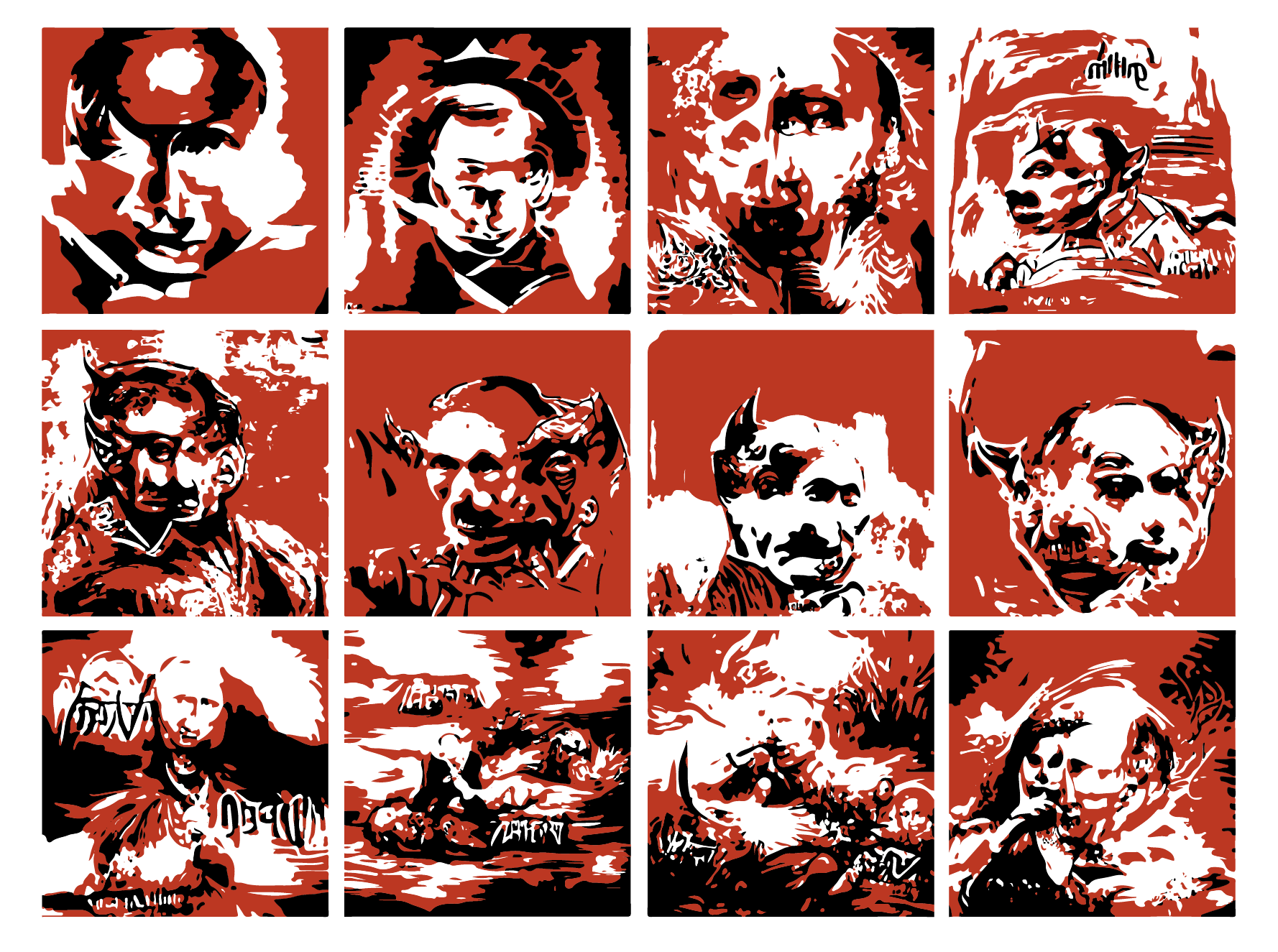

Compilation of 12 AI Vladimir Putin Themed Prompt Generated Images // 2022
1– 2 – Vladimir Putin Soviet Propaganda Poster
3 – Putin Opera Diva Death Metal Artwork
4 – 8 – Stalin Putin Hitler Goblin
9 – Putin Opera Diva Death Metal Artwork
10 – 11 – Violent Putin Death Metal Artwork
12 – Putin Opera Diva Death Metal Artwork
Graphic Design / Illustration // Prompt Driven AI Art Generator NightCafe, Adobe Illustrator
No To War! Peace To The World! - Audio Collage // 2022
Sound Production // Audio Interface, Microphone, Headphones, MIDI Controller, Steinberg Cubase
2 minutes 47 seconds
Sound Production // Audio Interface, Microphone, Headphones, MIDI Controller, Steinberg Cubase
2 minutes 47 seconds
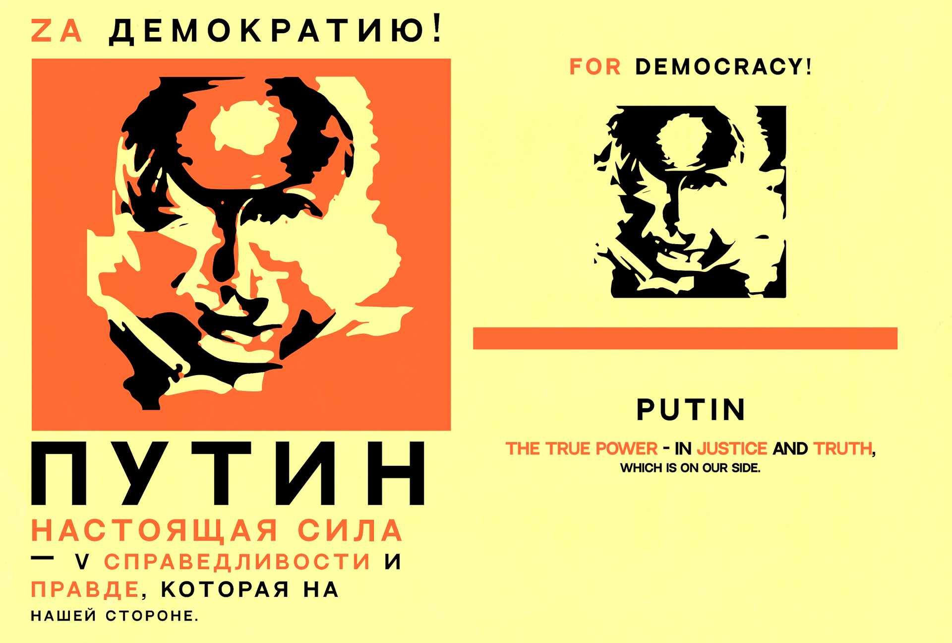
No To War! Peace To The World! / Propaganda Brochure Design // 2022
Graphic Design / Illustration // Prompt Driven AI Art Generator NightCafe, Adobe Illustrator
29,7 x 21 cm
Graphic Design / Illustration // Prompt Driven AI Art Generator NightCafe, Adobe Illustrator
29,7 x 21 cm
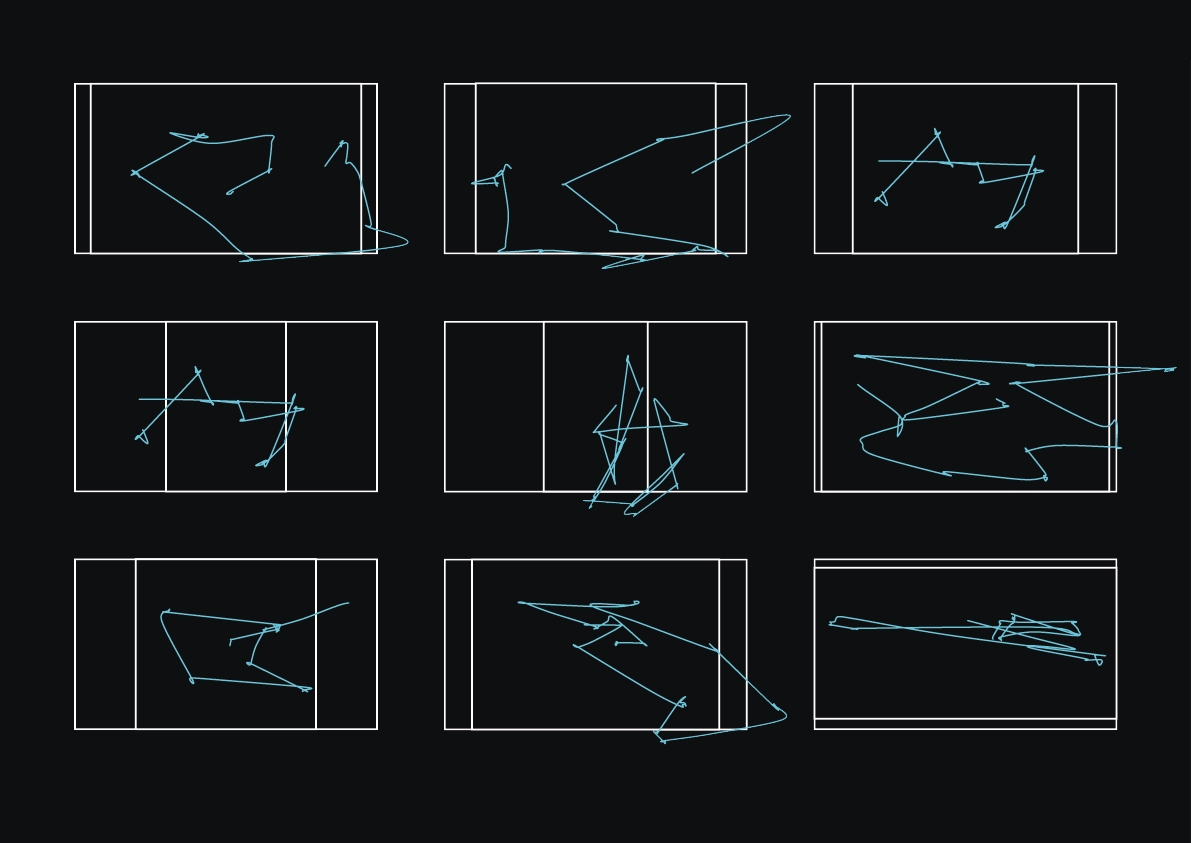
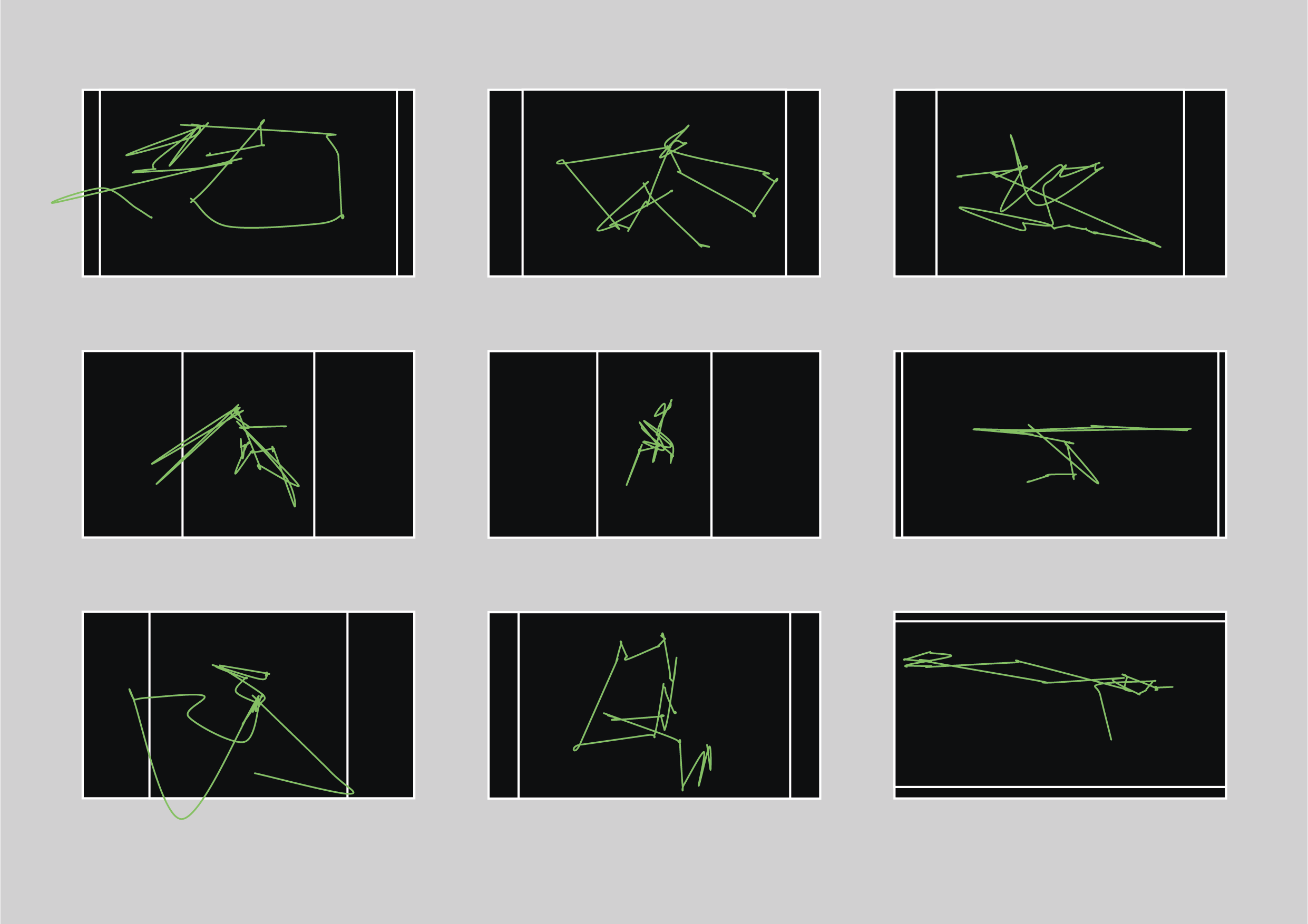
What Your Eyes Draw? Pt. 1 (2022)
Data Visualisation Project. Observational Drawing Experiment.
Creative Coding / Data VisualisationProcessing / Eye Tracking Technology / Axidraw / Fineliner Pen, Pencil, Ink on Paper
The aim of this project was to explore how technology could be used for data collection and then displayed in the more expressive way than usual pie charts. With the dynamic development of Artificial Intelligence and frequent discussions about it eventually replacing artist labour with my Eye Tracker experiment I am speculating and comparing computer vision to human one.
Human is a complex being, whenever we are looking at the world around us we are having full consciousness about our surroundings. Ability to connect points in our minds to define objects in the environment instantly, acknowledging them, creating associations and emotional sentimental attachments are points what are distinguishing us from machines the vision of which is binary and the base for it’s function is an available data set.
Outcomes I am presenting are set of drawings, which are mostly coming in pairs:
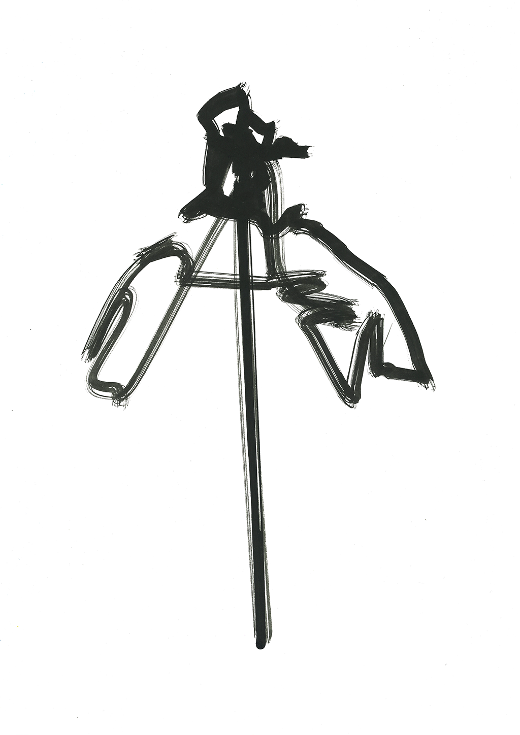
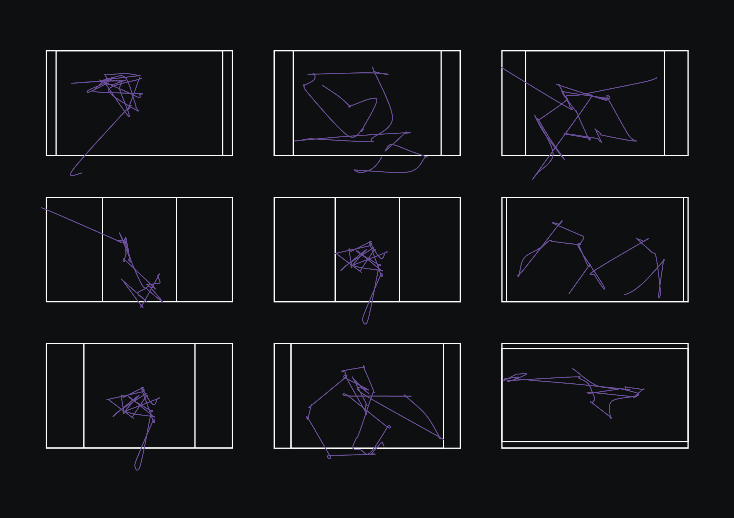
- Data from Eye Tracker during the process of me doing observational drawings in different time periods (starting with 60 seconds finishing with 10 seconds) plotted with AxiDraw.
- My actual blind drawing produced by hand as in order to get more accurate data from Eye Tracker I had to look at the computer screen consistently.

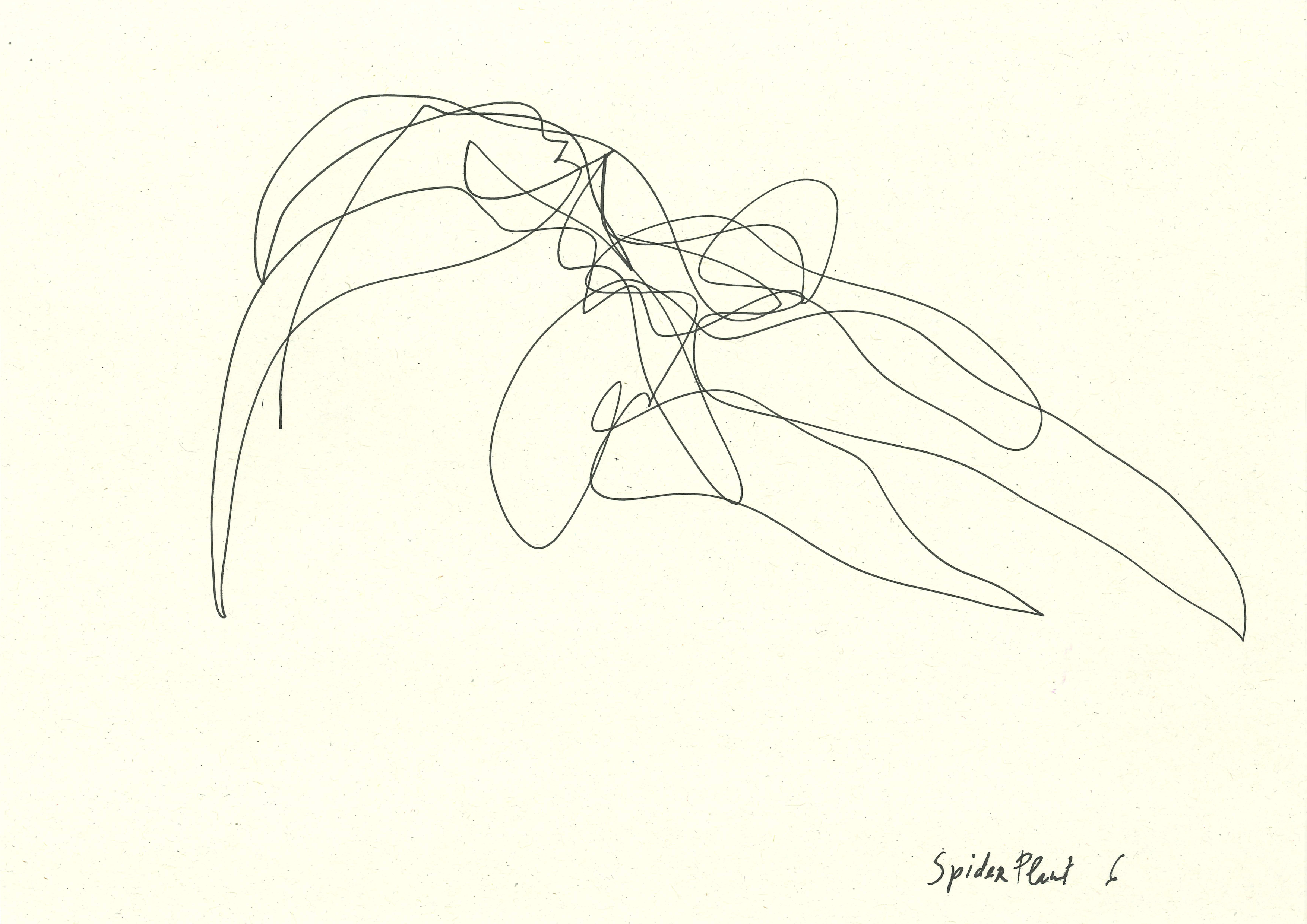
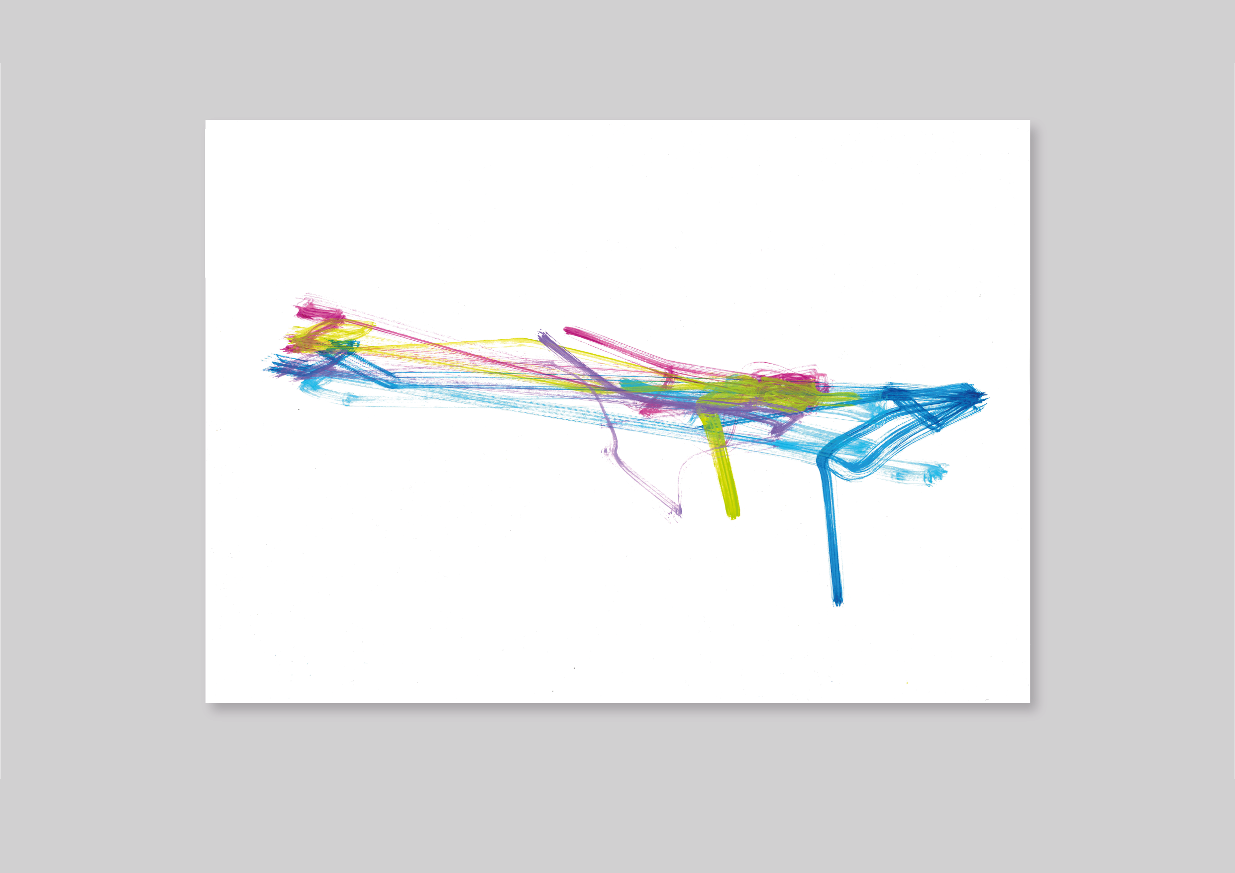
Compilation of Spider Plant Studies Nr. 1 - 6 / Fineliner Pen Data Plotted Drawings // 2022
Creative Coding / Data Visualisation // Fineliner Pen on Paper, Processing, Eye Tracker, Adobe Illustrator, AxiDraw
29.7 cm x 42 cm
Creative Coding / Data Visualisation // Fineliner Pen on Paper, Processing, Eye Tracker, Adobe Illustrator, AxiDraw
29.7 cm x 42 cm

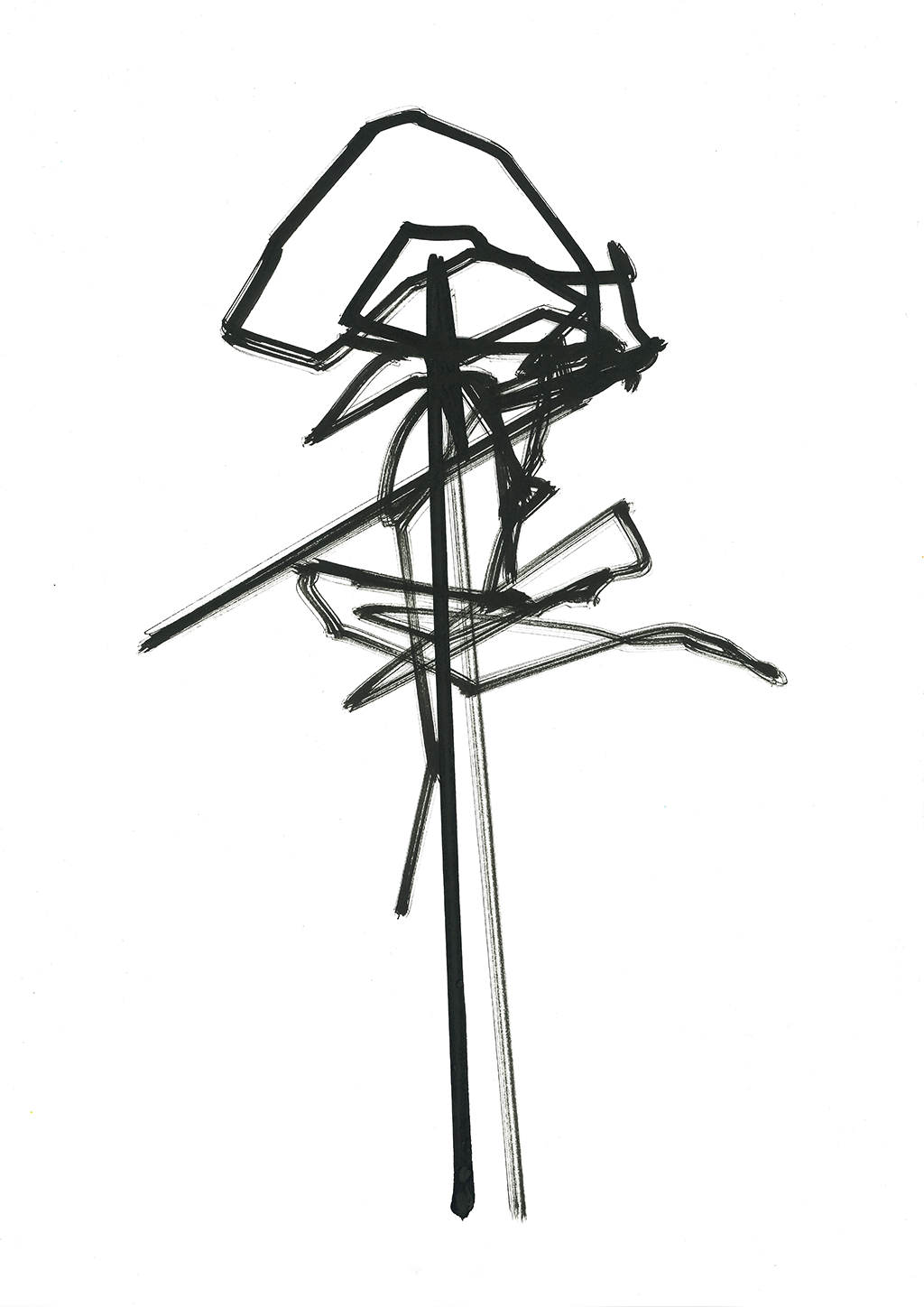
Spider Plant Study Nr. 1 / Duration 60 seconds (Attempt 1) / Hand Drawing // 2022
Pencil on Paper
29,7 x 21 cm

Spider Plant Study Nr. 3 / Duration 30 seconds / Hand Drawing // 2022
Fineliner Pen on Paper
29,7 x 21 cm

Spider Plant Study Nr. 5 / Duration 15 seconds / Hand Drawing // 2022
Fineliner Pen on Paper
29,7 x 21 cm

Spider Plant Study Nr. 2 / Duration 60 seconds (Attempt 2) / Hand Drawing // 2022
Pencil on Paper
29,7 x 21 cm

Spider Plant Study Nr. 4 / Duration 20 seconds / Hand Drawing // 2022
Fineliner Pen on Paper
29,7 x 21 cm
Spider Plant Study Nr. 6 / Duration 10 seconds / Hand Drawing // 2022
Fineliner Pen on Paper
29,7 x 21 cm
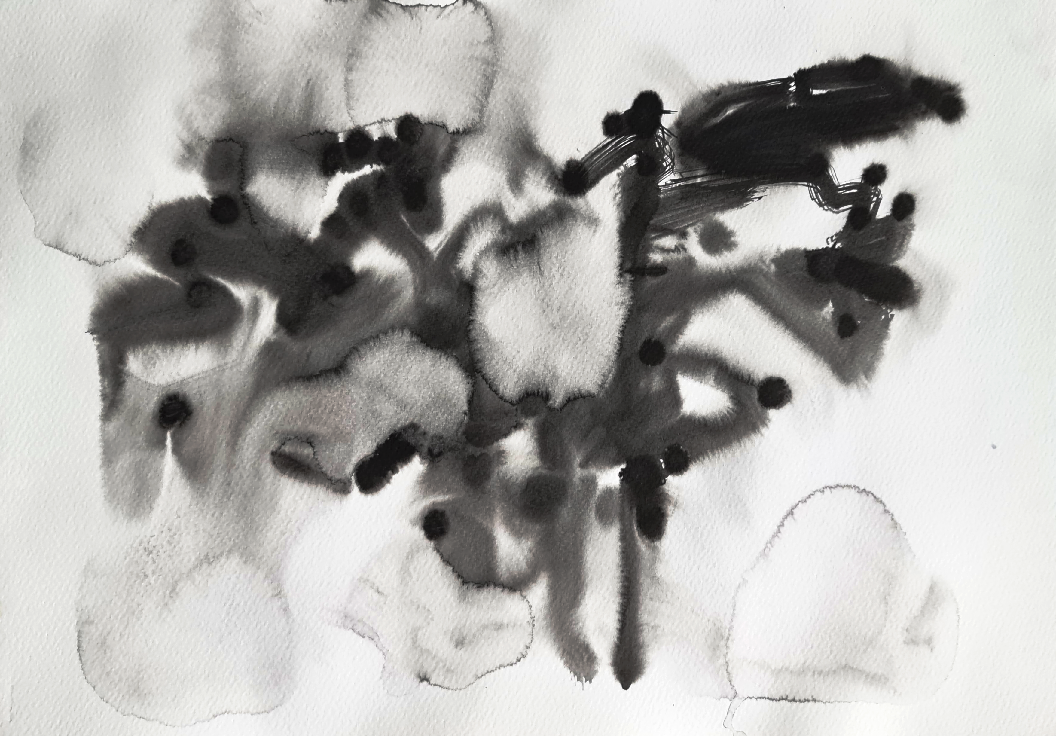
Common associations with plotter art are very precise technical fineliner pen drawings as the whole point of using AxiDraw medium is to achieve machinery inhuman precision. I, however, am always excited to see computers failing. For this reason I decided to use hardly controllable media, such as ink and brush on a wet paper to plot “Spider Plant Study Nr. 2” twice and ended up with 2 different looking artworks from the same data set. Outcomes are quite striking as the organic quality of the ink is creating an impression that these drawings were, actually, done by human, but incredibly straight lines done in non-human high speed with AxiDraw are breaking this illusion.


As I thought that one of the data sets for spider plant turned out to be
a success in terms of getting distinctive enough drawing, I wanted to find out how well Eye Tracker could be doing with portraiture. It is not like original blind drawings were very controlled, however, there are still similarities between computer vision and hand drawings even though machinery outcome is much more abstract.


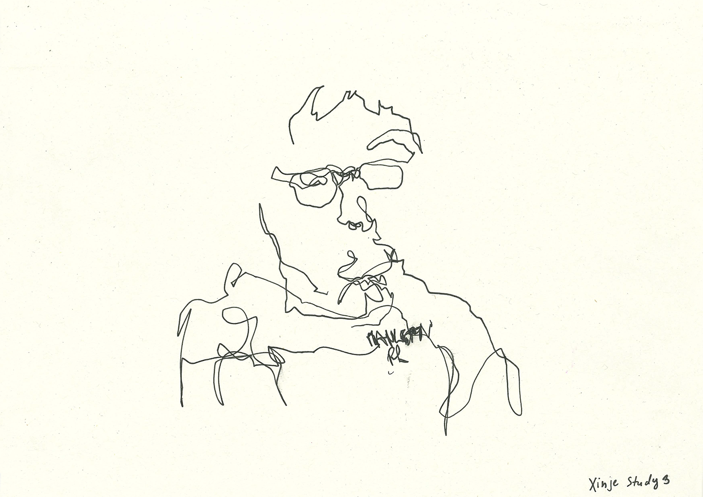
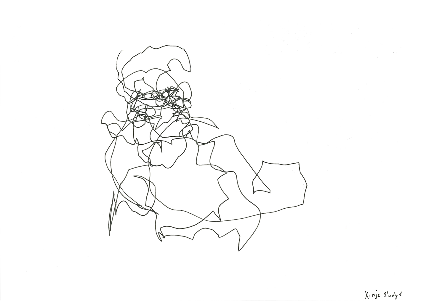
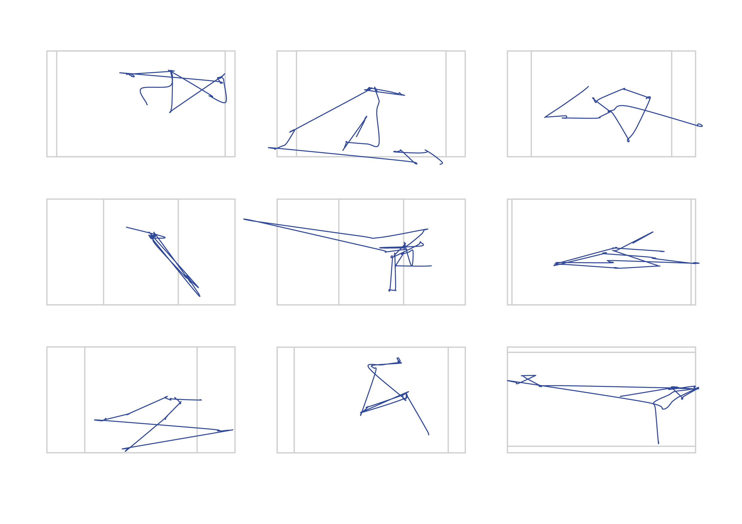
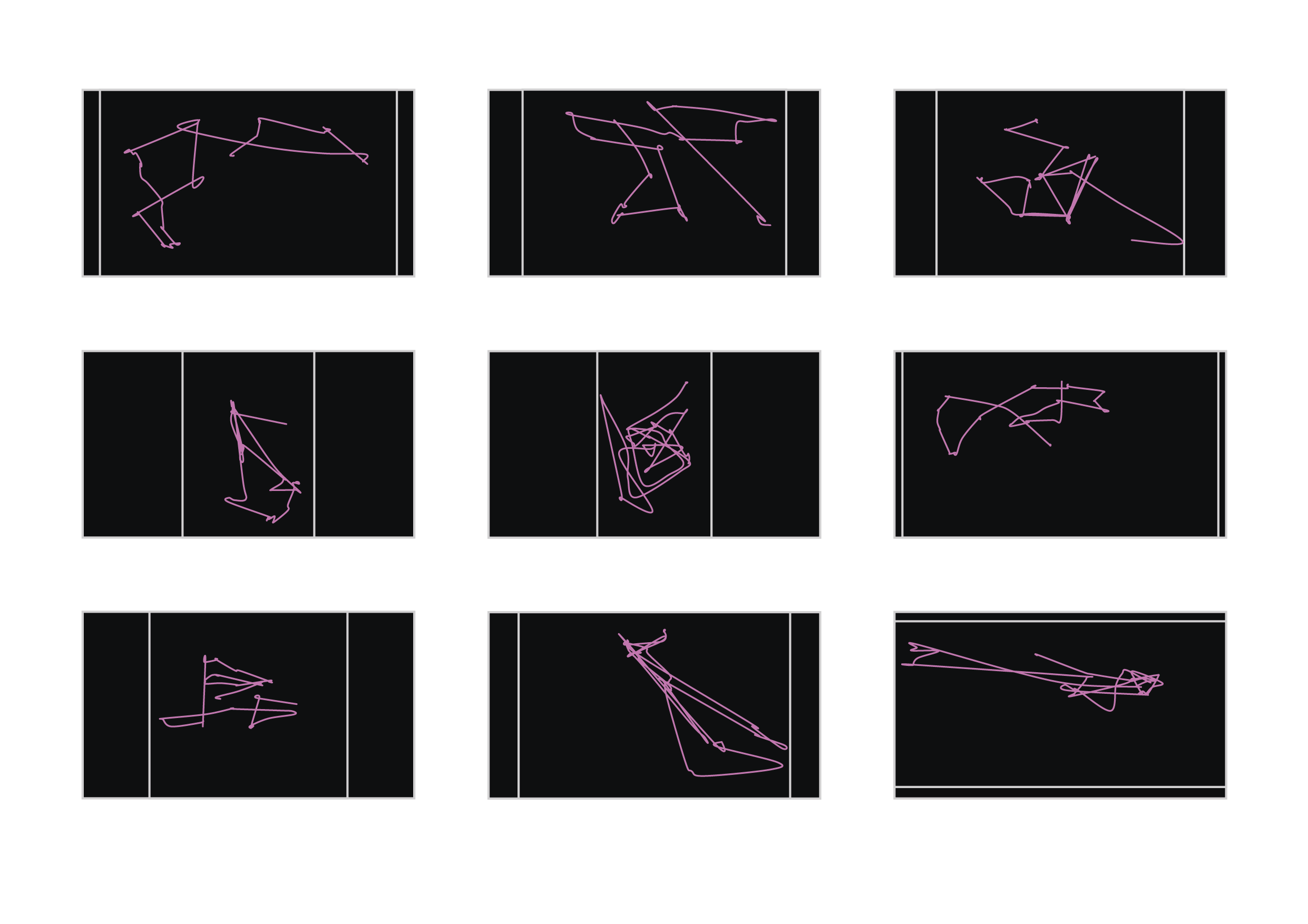
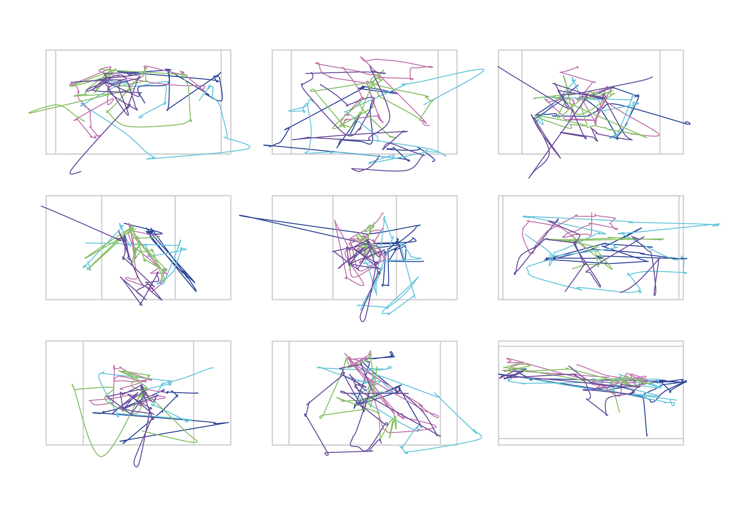
What Your Eyes Draw? Pt. 2 (2022)
Data Visualisation Project. Focal Point.
Here I am showing second set of my experiments using eye tracking technology.
Coming from the background of traditional art I was taught to appreciate artworks from different eras through analysis of composition, colour combination, techniques of paint or drawing material application.
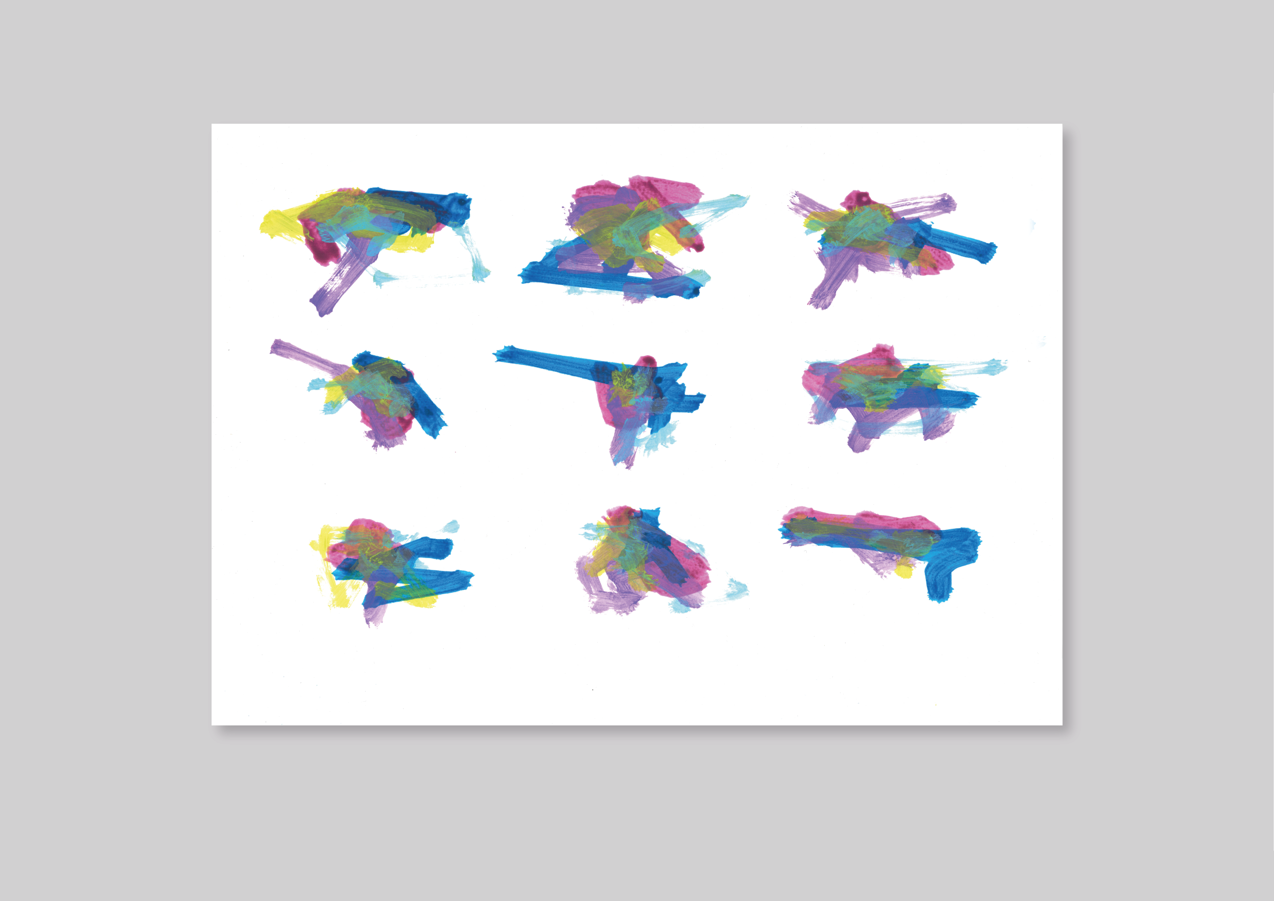
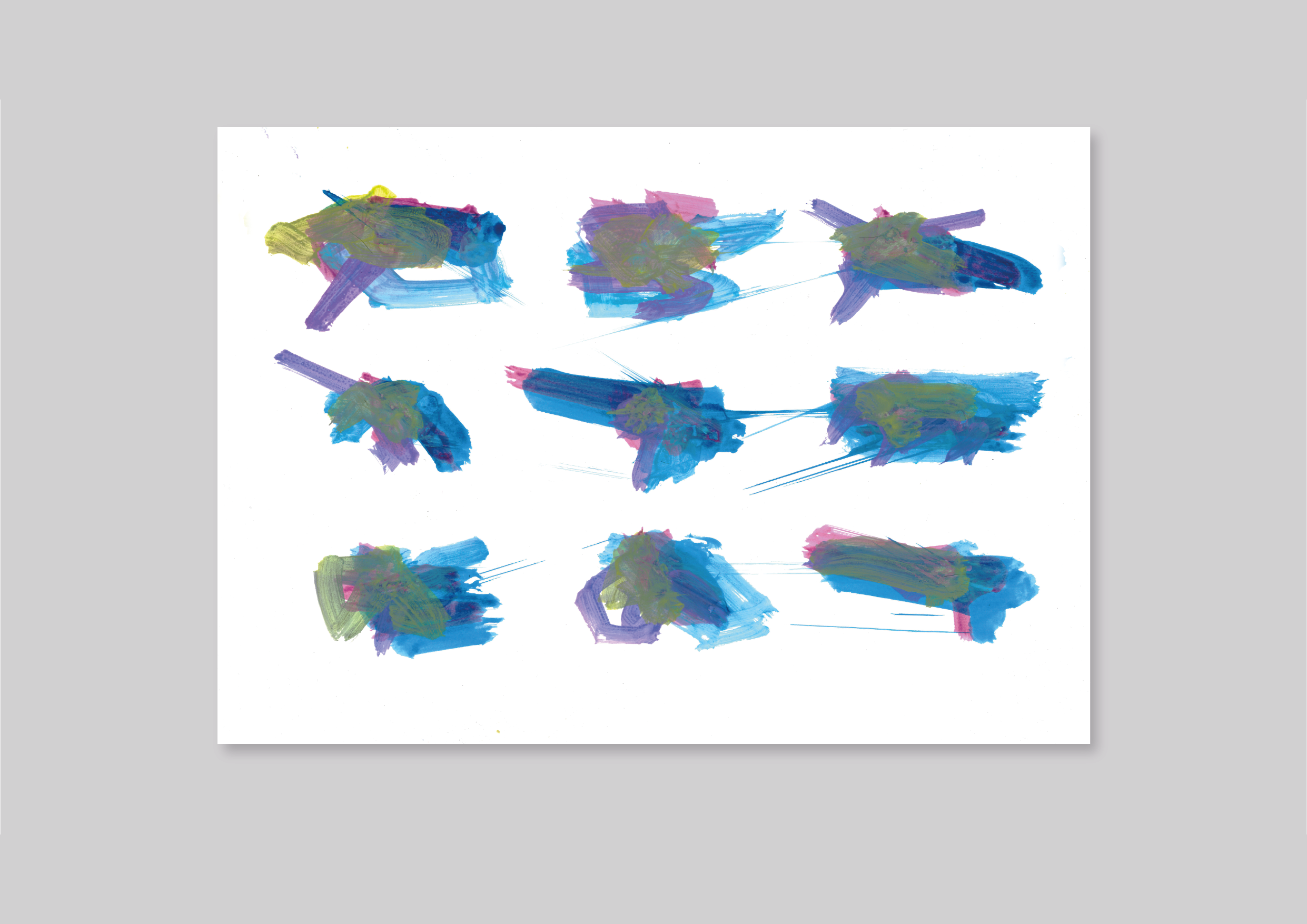

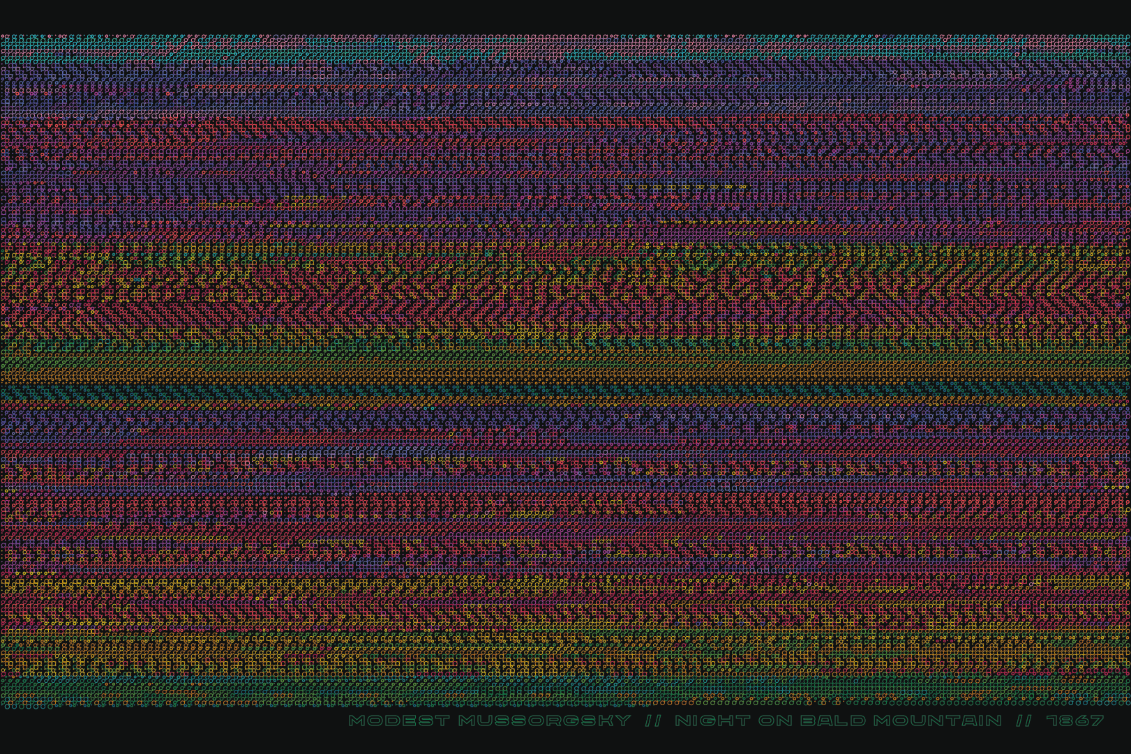
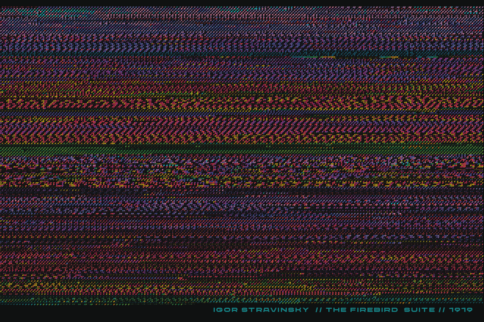
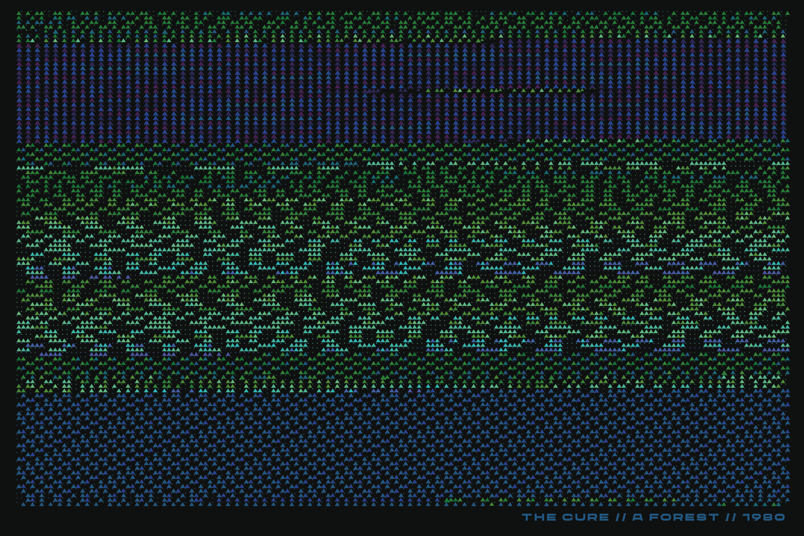
Imaginig Song Patterns (2021)
Creative Coding / Data VisualisationMIDI / Processing / Adobe Illustrator
“Imagine that you are painting with the sound!”
— Solveiga Raja
The Latvian National Opera and Ballet ex-Prima Donna
The Latvian National Opera and Ballet ex-Prima Donna


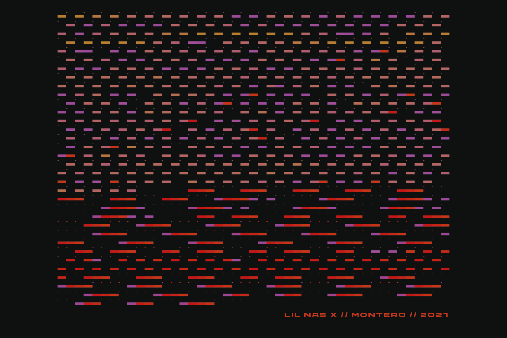
Imagining
Song Patterns is an extension to my Data Visualisation project at The
Glasgow School Of Art where I followed the concept “music as data”. I
always perceived music from an emotional standpoint even though I am
aware that a big part of it is structure, so creating visuals from
numbers turned out to be a new and exiting area to explore. The way I
was planning this project from the very beginning was taking multiple
songs/pieces from different genres and compare outcome patterns.
Finally, I have got chance to revisit this idea during GSA Open Share
weeks and bring it to satisfying conclusion.
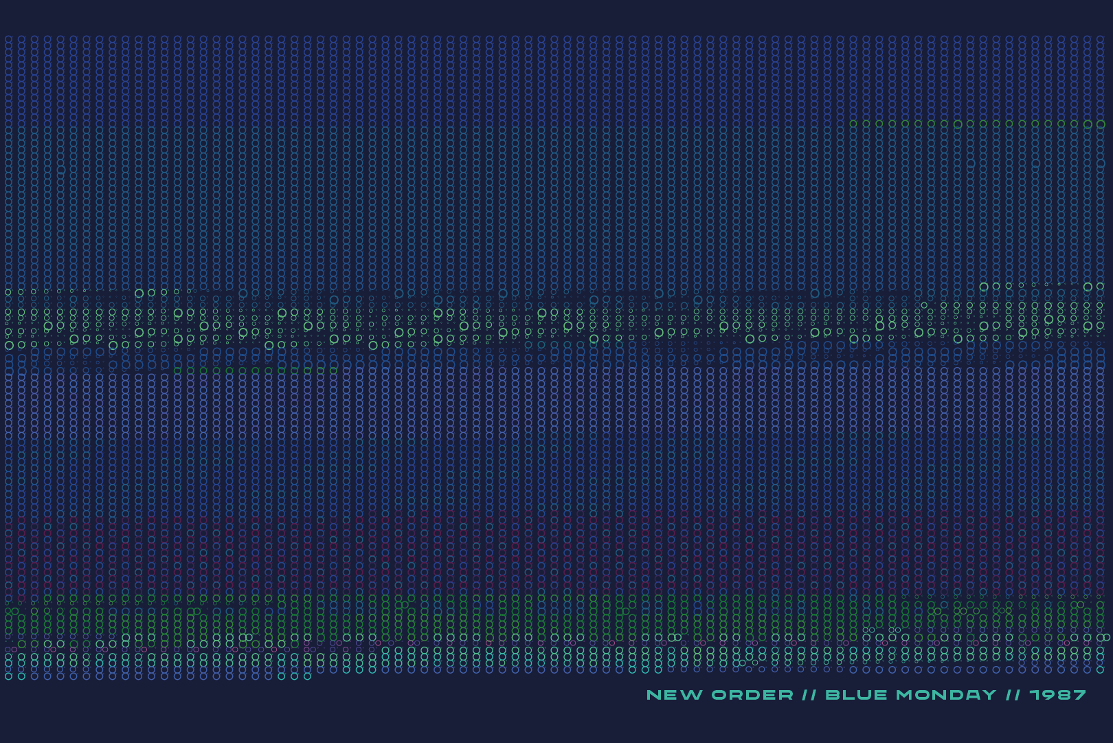
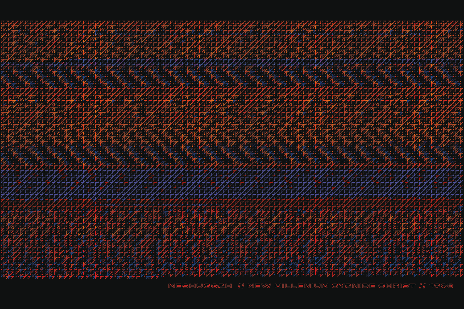
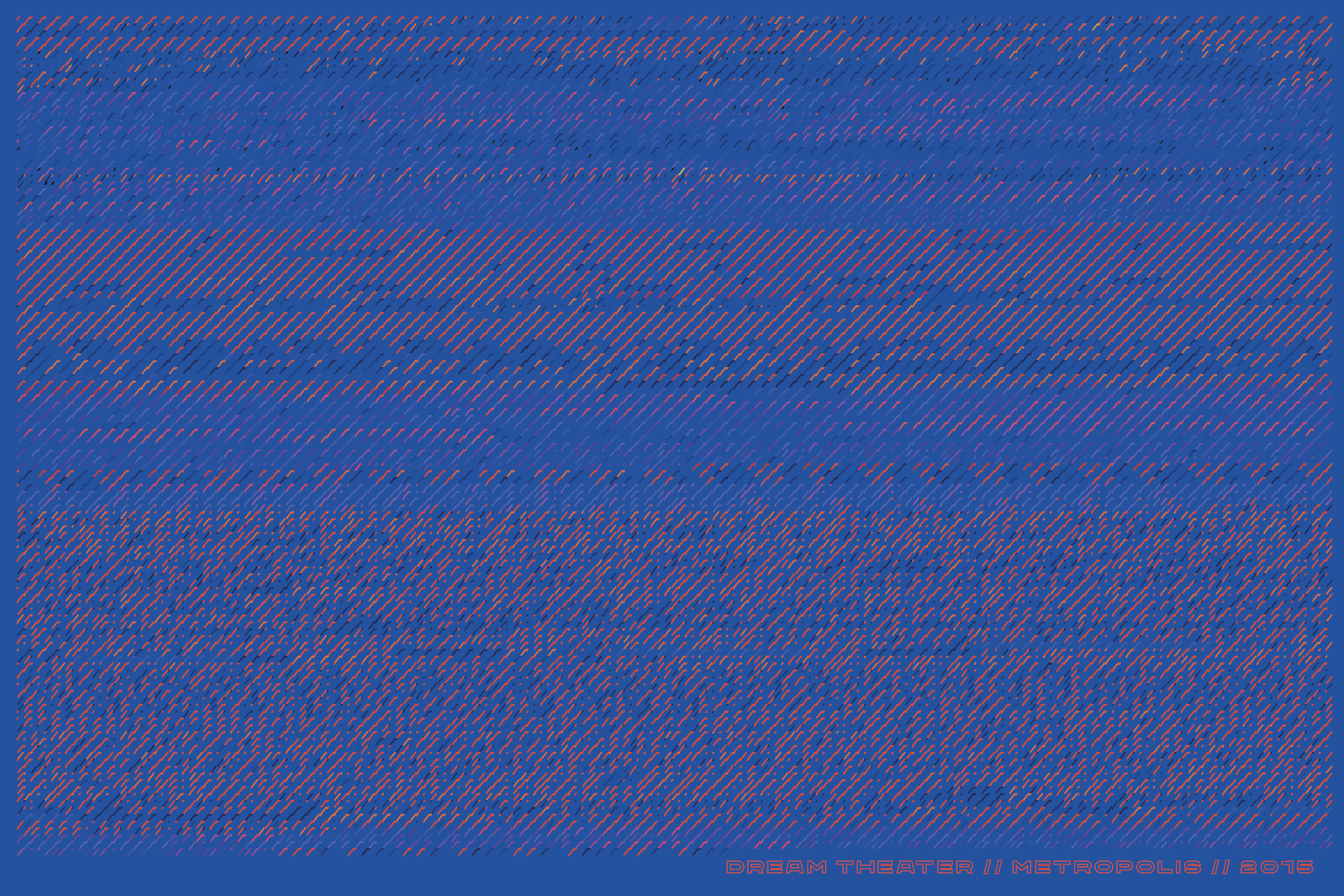
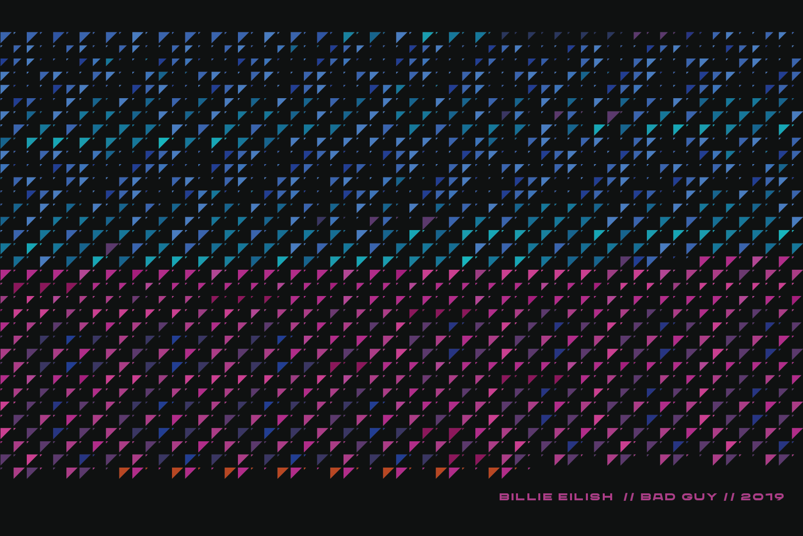
Each pattern is generated from MIDI file data after conversion to CSV (comma-separated values), so it displayed in a different form than traditional sheet music. Starting from the top all the parts for track 1, then 2, 3, etc. I took 5 genres: Rock/New Wave; Rap/Trap; Progressive Metal/Rock; Modern Pop; Classical, 2 songs in each genre, then I assigned colour palettes to different ranges. In general there are 11 possible ranges, from 1 to 10 contains 12 numbers which are 12 notes of an octave: C, C#, D, D#, E, F, F#, G, G#, A, A#, B. However, 11th range has 6 note shorter than other 10 ranges. During my experimentations I did not discover any song which would go extremely low or high, so the colours for these ranges did not make it to final patterns.
A big part of my art practice is to work with colour and, being maximalist in that aspect, I created 5 sets of colours for ranges in each genre. Some of them are similar but I tried to move them around so the results are not looking the same. In general, I have used a lot of colours so the changes in range are more visible on the final pattern.Despite being maximalist in colour, when it comes to the graphical part of visual work I am strongly influenced by the Bauhaus movement and constructivism. This is giving me inspiration to manipulate simple geometric shapes in many ways to get different results.
While
working on this project I asked myself the questions: Will the pattern
for modern pop song look smooth? Will the pattern of metal song be quite
abrupt because of precise and defined rhythms we usually hear? There
are many aspects such length, complexity of the arrangement, repetition.
Not surprisingly, the most simple looking patterns were in Rap songs
and the most complex ones in classical pieces. Obviously, just a few
songs is not enough to do any judgments on different genres, but I will
have to admit that when I was taking certain songs I already had vision
of how the final result will look.
The motivation behind this visual experiment is to analyse how digitalisation is affecting popular culture - a topic that became dominating in my projects this year. With development of technology, tools which used to be accessible only for professionals now are part of the simple user’s world. As a result we are producing an enormous amount of creative products. Musicians do not necessarily have to practice as much as they used to during wax cylinder times, bad timing is fixable with audio software tools, bad pitch with auto-tune, just as visual artists not necessarily having the skill of drawing a straight line as it is 2-second job on the computer. To learn new skill is easier than ever with couple words in the browser search, but all the knowledge is laying on the surface and we do not necessarily want to go into depth considering overflow of information.
The rhetorical question would be: "Is modern age human losing the ability to perceive more complex information and 4 chord structured songs on the Billboard is what we actually want to hear, or have we not discovered the full potential of digital tools in order to progress and more Magnum Opuses yet to come?"